CSS Font Sizing
Following on from last week's article in which I briefly discussed css pixel sizing, I decided to look into the different ways you can declare your font size with CSS.
Meet the Units #
There are several different ways you can declare the size of a font in CSS. Broadly speaking, the units fall into one of two categories - absolute and relative.
Absolute units are fixed and (mostly) relate to some physical measurement. Once they are declared, their size cannot be altered by changing the font size of some other element.
Relative units do not have an objective measurement. Instead, their actual size is determined by the size of a parent element. This means that their size can be altered by changing the sizing of that dependent element.
Here is a brief overview of some of the units -
| Unit | Type | Description |
|---|---|---|
| px | Absolute | 1 “viewport pixel” |
| pt | Absolute | 1 point is 1/72 of an inch |
| pc | Absolute | 1 pica is equal to 12 points |
| % | Relative | Relative to the parent element’s font size |
| em | Relative | Relative to the parent element’s font size |
| rem | Relative | (root em) Relative to the html font size |
| keyword | Relative | xx-small, x-small, small, medium, large, x-large, xx-large |
| vw | Relative | 1/100th of the width of the viewport |
| vh | Relative | 1/100th of the height of the viewport |
| vmin | Relative | 1/100th of the viewport’s smaller dimension (height or width) |
| vmax | Relative | 1/100th of the viewport’s larger dimension (height or width) |
You can see an exhaustive list of units here, but I will focus on what I think are the most relevant units - px, pt, %, em, rem, and vw.
What's the difference? #
The difference between these units can be difficult to understand conceptually, so it is best to demonstrate their differences with practical examples.
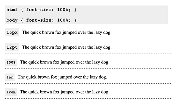
Example 1 - Default Settings #
In a blank HTML document, without you declaring any font sizing, there are default settings used. In most browsers, the default font size for the html and body tags is 100%. This equates to the following -
100% = 1em = 1rem = 16px = 12pt
This means that if you set the font size of one <p> to 100% and another <p> to 16px, they will render as the same size on screen. You can see this demonstrated here -
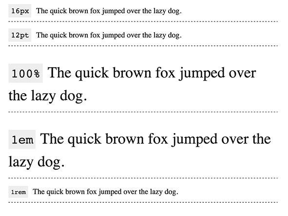
Example 2 - Absolute vs Relative Units #
The difference between absolute and relative units can be highlighted by altering the html font size. If we set html { font-size: 200% }, this will affects only the <p>s with relative font size units.
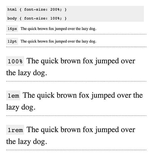
This is a key advantage of using relative units. With the ability to scale the font sizes so easily, you can create a truly responsive site, just by altering the html font size. Max Luster has a great example of this here.
Example 3 - rem vs em (and %) #
The Em (and %) unit works by calculating the current font size based on the parent element's font size. For example -
html {
  font-size: 100% /* =16px */
}
body {
  font-size: 2em; /* =32px */
}
p {
  font-size: 1em; /* =32px */
  /* font-size: 0.5em; =16px */
}
Because p inherits from body, which inherits from html, the paragraphs set in em and % units turn out twice the size we may have intended.
When you use em units for an element, you have to take into account the font size of all the parent elements. As you can see, this can get complicated and messy pretty quickly.
The solution to this problem is rem. rem is calculated based on the html font size only, not the parent element. For example -
html {
  font-size: 100% /* =16px */
}
body {
  font-size: 2rem; /* =32px */
}
p {
  font-size: 1rem; /* =16px */
}
Using rem allows you to have the scaling abilities of em and %, but without having to deal with nesting issues.
Example 4 - Viewport width sizing #
The vw unit, a new CSS3 unit uses the viewport width to calculate the font size. This allows for a more fluid responsive font sizing.
Although this seems like a great unit for responsive design, I personally am not a fan of it. It doesn't give me enough control over the size of the font, which almost always works out to be too big or too small.
My Method #
Until I did this research, I was just using pixels to set my font sizes. This is because, nowadays, most browsers allow the user to zoom in if the text is too small for them, and so there is no accessibility issue.
However, I have found this method quite limiting in terms of ability to scale. Although my font sizing looks good on medium and small screens, it could be better optimised for larger ones. Even if users have the option to zoom in, that isn't something we want them to need to do.
My solution is therefore to work with rem (using pixels as a fallback).
html {
  font-size: 62.5%; /* sets the base font to 10px for easier math */
}

body {
  font-size: 16px;
  font-size: 1.6rem;
  /* sets the default sizing to make sure nothing is actually 10px */
}

h1 {
  font-size: 32px;
  font-size: 3.2rem;
}
This allows me to scale up my font sizes simply by writing -
@media screen and (min-width: 1280px) {
  html {
    font-size: 100%;
  }
}
This method uses pixels as a fallback unit because rem isn't supported on IE8 and below. One issue this creates is when I change the base font size for scalability like above, this doesn't apply for the fallback font size. However, I don't consider this a huge issue because the ability to scale for larger devices is more of an extra feature than it is a core one.
If you have any ideas of how I can improve on this, let me know in the comments. I might also write a SCSS mixin so I don't have to input both the fallback and the rem units.