Form Validation Techniques
We all know that online forms can be a hassle to have to fill out. Especially when there is nothing but a list of inputs presented without much guidance or feedback. But as form creators, there are many things we can do to improve the experience for the users filling out forms online.
Using CSS #
Using CSS, we have access to four states of a form input with pseudo-classes - :valid, :invalid, :required and :optional. We can use these states to provide some - albeit limited - feedback to users as they fill out the form.
Using :valid and :invalid, we can let users know, in real time, if their input satisfies all the requirements necessary.
input:valid { border-color: green; }
input:invalid { border-color: red; }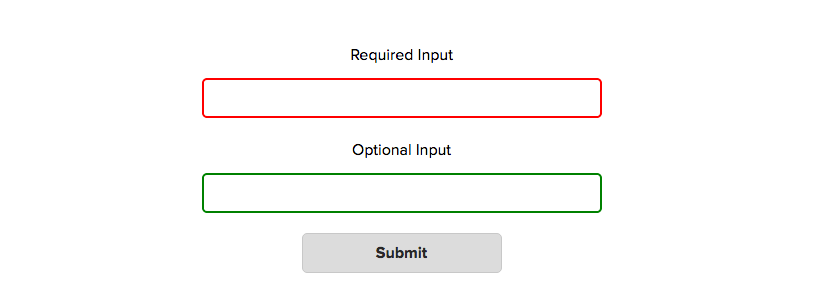
One problem with using this method, however, is that the styles are applied even before the user starts to act on the form. For required inputs, they will show us as :invalid, and optional inputs will show as :valid. This means that before the user is even given the chance to start, they may already be given negative feedback, which isn’t a great experience.
Styling :required and :optional states alone is typically not very useful either as this is information that is usually given in a label. However, we may want to combine these states with the :valid/:invalid pseudo-classes and only style certain combinations. For example, we may want to only give positive feedback when a required input is valid.
input:required:valid { border-color: green; }
Using JavaScript #
Using JavaScript, we can create a much better user experience when filling out forms. For example, consider these three number inputs, each of them requiring a minimum value of 10, a maximum of 100, and a step of 10.
<form>
    <label>
        Number Input 1
	 <input type="number" min="10" max="100" step="10">
    </label>
    <label>
        Number Input 2
	 <input type="number" min="10" max="100" step="10">
    </label>
    <label>
        Number Input 3
	 <input type="number" min="10" max="100" step="10">
    </label>

    <input type="submit">
</form>
By setting the min, max and step attributes, we can control the number the user inputs only if they use the controls on the input element. However, this doesn’t stop the user from manually typing in invalid numbers. If they type in 1, 12, and 123 respectively to the three inputs and submits the form, this is what happens -
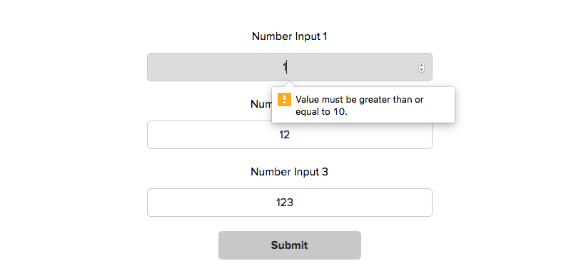
What happens is the user only gets an error message for the first input and they only get one error message, even though the input violates 2 of the requirements. We can fix this by modifying the validity message being passed.
Adding multiple error messages to one tooltip #
When validating inputs, the browser does checks for a defined list of potential invalidites. There is an object, validity, that is attached to all inputs. It contains a list of keys with boolean values, each checking if a certain type of invalidity applies to this input. For example, this is the validity object returned when the user inputs 1 on the previous input.
input.validity = {
    valid:false // If the input is valid
    customError:false // If a custom error message has been set
    patternMismatch:false // If the invalidity is against the pattern attribute
    rangeOverflow:false // If the invalidity is against the max attribute
    rangeUnderflow:true // If the invalidity is against the min attribute
    stepMismatch:true // If the invalidity is against the step attribute
    tooLong:false // If the invalidity is against the maxlength attribute
    tooShort:false // If the invalidity is against the minlength attribute
    typeMismatch:false // If the invalidity is against the type attribute
    valueMissing:false // If the input is required but empty
}
By default, the browser will only display one of these invalidities. So what we can do instead is check each of these values ourselves and, if we find an invalidity, store it. Once we have stored all the invalidity messages for an input, we can then set the whole list as a custom validity message using the setCustomValidity() function.
function CustomValidation() { }
CustomValidation.prototype = {
	// Set default empty array of invalidity messages
	invalidities: [],

	// Function to check validity
	checkValidity: function(input) {

		var validity = input.validity;

		if ( validity.patternMismatch ) {
			this.addInvalidity('This is the wrong pattern for this field');
		}
		if ( validity.rangeOverflow ) {
			var max = getAttributeValue(input, 'max');
			this.addInvalidity('The maximum value should be ' + max);
		}
		if ( validity.rangeUnderflow ) {
			var min = getAttributeValue(input, 'min');
			this.addInvalidity('The minimum value should be ' + min);
		}
		if ( validity.stepMismatch ) {
			var step = getAttributeValue(input, 'step');
			this.addInvalidity('This number needs to be a multiple of ' + step);
		}
		// Additional validity checks here...
	},

	// Add invalidity message to invalidities object
	addInvalidity: function(message) {
		this.invalidities.push(message);
	},

	// Retrieve the invalidity messages
	getInvalidities: function() {
		return this.invalidities.join('. \n');
	}
};

// On click of form submit buttons
submit.addEventListener('click', function(e) {
    // Loop through all inputs
	for ( var i = 0; i < inputs.length; i++ ) {

		var input = inputs[i];

		// Use native JavaScript checkValidity() function to check if input is valid
		if ( input.checkValidity() == false ) {

            var inputCustomValidation = new CustomValidation(); // New instance of CustomValidation
			inputCustomValidation.checkValidity(input); // Check Invalidities
			var customValidityMessage = inputCustomValidation.getInvalidities(); // Get custom invalidity messages
			input.setCustomValidity( customValidityMessage ); // set as custom validity message

		} // end if
	} // end loop
});
Doing, this, when the form from above is submitted again, this is what happens -
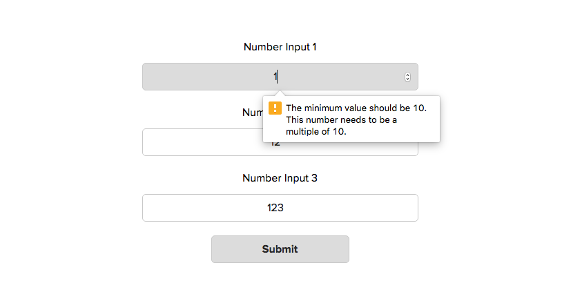
This is better, because all the error messages for that input are now being displayed. However, we still have the problem that only the error message for the first input is being displayed.
This is a limitation of the native browser validation message. So, we need to find an alternative.
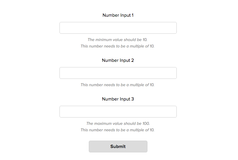
Displaying all error messages for all inputs #
Instead of using the built-in tooltip, we can add the error messages to the DOM directly. This way, all the error messages for each input will be clearly displayed next to them.
We can do this very simply with a couple of additional lines -
CustomValidation.prototype.getInvaliditiesForHTML = function() {
    return this.invalidities.join('. <br>');
}

// On click of form submit buttons
submit.addEventListener('click', function(e) {
    // Loop through all inputs
	for ( var i = 0; i < inputs.length; i++ ) {

		var input = inputs[i];

		// Use native JavaScript checkValidity() function to check if input is valid
		if ( input.checkValidity() == false ) {

            var inputCustomValidation = new CustomValidation(); // New instance of CustomValidation
			inputCustomValidation.checkValidity(input); // Check Invalidities
			var customValidityMessage = inputCustomValidation.getInvalidities(); // Get custom invalidity messages
			input.setCustomValidity( customValidityMessage ); // set as custom validity message

			// DISPLAY ERROR MESSAGES IN DOCUMENT
			var customValidityMessageForHTML = inputCustomValidation.getInvaliditiesForHTML();
		    input.insertAdjacentHTML('afterend', '<p class="error-message">' + customValidityMessageForHTML + '</p>')
			stopSubmit = true;

		} // end if
	} // end loop
    if ( stopSubmit ) { e.preventDefault(); }
});
Now, this is what happens when the user clicks submit -
Using custom validation checks #
Sometimes, the validation checks available in the browser may not be enough. We may want to check the inputted value against some custom requirements, for example if a text input requires special characters.
Since we are already checking for each validity message separately in our CustomValidation.prototype.checkValidity function, we can easily add additional checks here as well.
CustomValidation.prototype.checkValidity = function(input) {

    // In-built validity checks here ------

    // Custom Validity checks ------
    if ( !input.value.match(/[a-z]/g) ) {
    	this.addInvalidity('At least 1 lowercase letter is required');
    }
    if ( !input.value.match(/[A-Z]/g) ) {
	this.addInvalidity('At least 1 uppercase letter is required');
    }
}
Realtime validation #
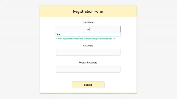
Although this is a lot better, it is not without its flaws, the biggest being that the user has to submit the form before they get any specific feedback on what exactly is wrong with their inputs. However, the best user experience for forms is when validation happens in real time. There are three parts to this -
- The requirements for each input are clearly displayed even before the user starts typing
- As the user starts typing on the field and fulfils each requirement, they are given real time feedback on their success (or failings)
- The feedback is presented in such a way that the user will not submit the form without knowing of the errors in their input
In next week's article (see here), I'm going to show how I implement real-time validation, by recreating this simple registration form -
If you'd like to try recreating this (or a better version) yourself before then, you can use this boilerplate code.