The Problem with iOS Safari and shrink-to-fit
For a long time, the standard viewport meta tag went like this -
<meta name="viewport" content="width=device-width, initial-scale=1">However, since iOS Safari 9.0 was introduced in September last year, a new additional value is now needed for most responsive websites, making this the new standard meta tag -
<meta name="viewport" content="width=device-width, initial-scale=1, shrink-to-fit=no">Why do we need to add this new value? #
To understand why we need to include this new value, we need to observe what happens if we don’t include it.
Nowadays, the majority of elements are styled with responsive dimensions. This means using adaptive units like percentages and viewport units, rather than simple pixels. However, there are some circumstances in which a fixed-width element is included. And, the width of the element is not necessarily smaller than the width of the viewport. For example, a 800px-wide div on an iPhone.
Normally, the behaviour we would expect is that there will be an overflow, and a scrollbar will be introduced to enable the user to see the rest of the width of the content. However, when Safari is in the new Split View mode (i.e. when there are multiple apps open side-by-side on the screen), this doesn't happen.
What happens instead is that Safari manipulates the viewport to be equal to the width of the overflowing element, e.g. 800px, so that it's entirety fits on the screen. The effect of this is that the rest of the page is "shrunk to fit" the larger element.
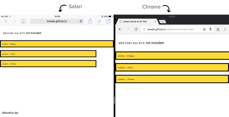
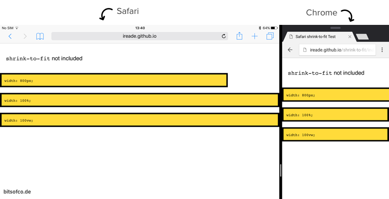
And we can also see that when the fixed-width element is not larger than the viewport, everything is normal.
Why does Safari behave this way? #
According to the developers working on WebKit, the reason for this is because, based on their data, the majority of websites were misusing the meta viewport tag.
@KMuncie It is intentional. Only a minority of websites were using "initial-scale=1" or "width=device-width" correctly so this was added :( — Benjamin Poulain (@awfulben) September 22, 2015
Instead of using the standard value of width=device-width, initial-scale=1, they were either hard-coding viewport sizes or missing it altogether. Therefore, because of the introduction of Split View, a lot of websites were not prepared for the enforced responsiveness and broke.
Adding shrink-to-fit #
Apple's response to this problem was to, by default, shrink all overflowing content on the page to fit the width of the browser viewport. For websites that are responsibly responsive, we can add the new viewport meta value, shrink-to-fit=no, to signal this to Safari and disable this default feature.
<meta name="viewport" content="width=device-width, initial-scale=1, shrink-to-fit=no">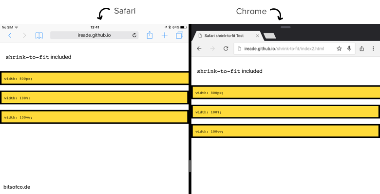
Although we don't know if Apple will keep this around forever, it is certainly here to stay for the foreseeable future, until the balance between properly responsive websites and those that aren't falls on the correct side.