6 Reasons to Start Using Flexbox
Do you use flexbox? Last week on twitter, I asked this question and was surprised to find out that less than 50% of people answered yes. This was surprising to me because, up until recently, I wasn't using flexbox in any production projects either, and I thought I must be the only one.
There were a number of reasons why I hadn't started using flexbox regularly but, having done more research, my concerns have subsided and I've become a convert. So, here are 6 reasons you should start using flexbox (too).
1. It’s supported in all major browsers #
The main reason I hadn’t been using flexbox was because of a perceived lack of browser support. But in actual fact, flexbox is very well supported, at 95.89% global support. If you disregard IE 10 and below, which Microsoft says you now can, this number is even higher.
Flexbox has even more support than other features I still use such as 2D transforms (with 91.85%) or even position:fixed (with 92.98%).
2. You don’t have to worry about syntax #
Even though the current syntax of flexbox is supported in the current versions of all browsers, what about the old versions? Because the syntax has changed over the years, there is some inconsistency in how to write it. To support the last 2 versions of all browsers currently, we would have to write at least 4 versions of every rule using various vendor prefixes.
The solution to this I have settled on is to just use autoprefixer. Keeping track of which vendor prefixes we need to use for what isn’t necessarily the best use of our time and effort, so we can and should automate it.
Using autoprefixer, we can specify which browser versions we want to support, and the correct vendor prefixes will be automatically added.
/* Write this */
.flex-container {
  display: flex;
}

/* Compiles to this (with autoprefixer set to support last 2 versions of all browsers) */
.flex-container {
  display: -webkit-box;
  display: -webkit-flex;
  display: -ms-flexbox;
  display: flex;
}
3. It can be simple to get started #
Admittedly, learning all of flexbox isn’t so straightforward. There are 12 new properties, each with an average of 4 potential values. It can be a bit overwhelming to jump right in with everything.
But you don’t have to start with everything. For a great number of circumstances, I find myself only needing to use 3 properties -
display- This sets the element as an inline or block flexbox container elementjustify-content- This controls the horizontal alignment of items within the flex container (If the flex-direction is the default value of row or row-reverse)align-items- This controls the vertical alignment of items within the flex container (If the flex-direction is the default value of row or row-reverse)
With these properties alone, which are applied to the flex container, we can produce a lot of different layouts. And when you’re ready to learn more, there is an abundance of resources/cheatsheets/exercises to help you learn -
- Flexbox Playground - A live document you can play around with to test the effect of each property-value pair
- A Complete Guide to Flexbox (CSS Tricks) - An overview of all of flexbox
- Flexbox Froggy - A game for learning CSS flexbox
- Flexbugs - A community-curated list of flexbox issues and cross-browser workarounds for them
- Flexibility - A polyfill to support legacy browsers
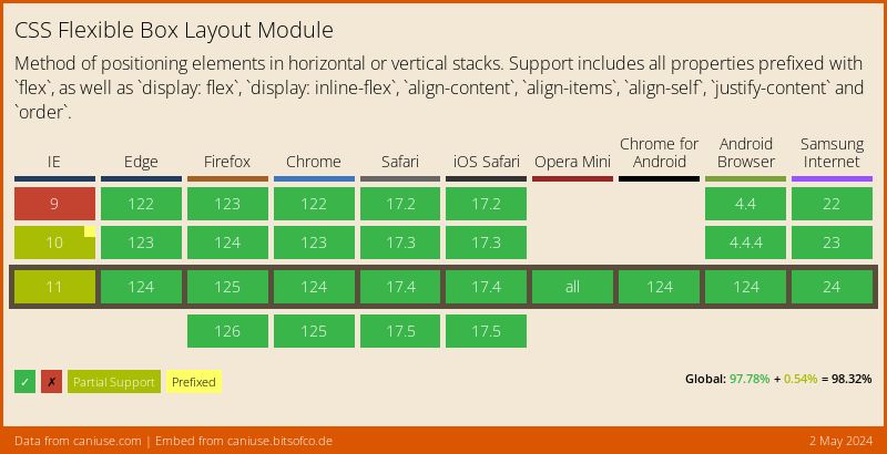
4. You can finally centre elements #
Besides the support for flexbox, a reason to use it is the ease in which we can centre elements, both horizontally and vertically.
With only 3 declarations, we can achieve a perfectly centred child element -
.flex-container {
  display: flex;
  justify-content: center; /* horizontal centering */
  align-items: center; /* vertical centering */

  border: 2px dashed #000;
}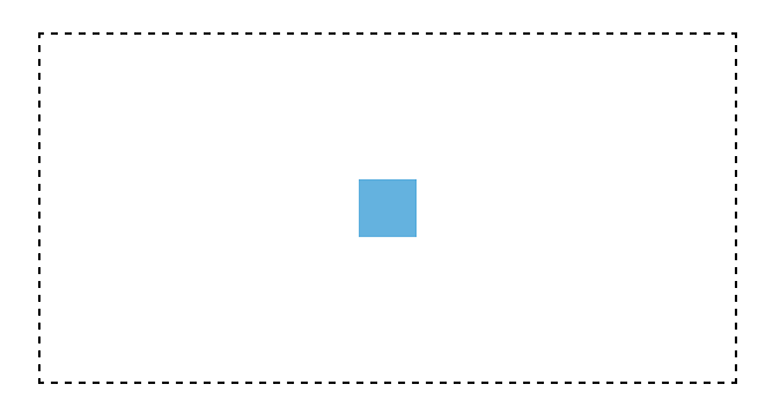
5. You can manipulate inline elements easily #
One issue with having inline items positioned beside each other is the infamous extra 4px margin. Although there are ways to get around this, like floating the elements, that comes with its own problems as well.
With flexbox, we can deal with inline elements effortlessly. We can align the elements edge-to-edge -
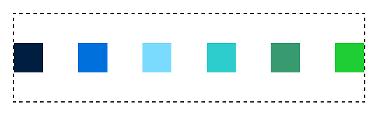
.flex-container { display: flex; }
.flex-item { width: 20%; }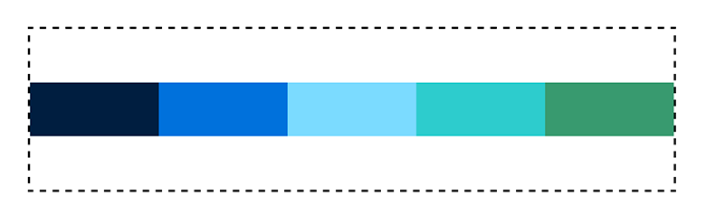
We can have space evenly distributed on both sides of the items -
.flex-container {
  display: flex;
  justify-content: space-around;
}
We can even have the space distributed evenly between only the middle items, without dealing with :first-child or :last-child -
.flex-container {
  display: flex;
  justify-content: space-between;
}
6. It simplifies complexity #
The reason flexbox was created in the first place was for this very reason, to allow us to achieve the complex layouts we already create, in as little as one declaration.
In the previous examples, I showed what could be done by styling the flex container alone. However, we can achieve much more fine-tuned styling by targeting the flex items. For example, a common layout for pricing tables is this -
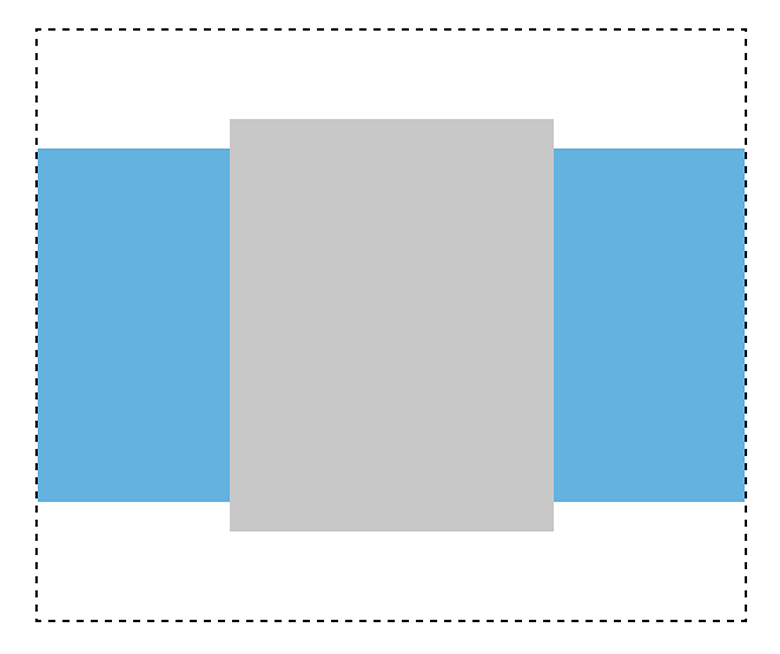
There are three divs, and the middle one is twice the width of the others. To achieve this layout using flexbox, we could write.
.flex-container {
  display: flex;
  align-items: center;
}

.flex-items:not(:nth-child(2)) {
  flex-grow: 1;
  height: 300px;
}

.flex-items:nth-child(2) {
  flex-grow: 2;
  height: 350px;
}
I realise I'm late to the party, but thought there may still be other people out there that needed the extra nudge. Do you already use flexbox? If not, have you been convinced to give it a try?