Alternatives to Floating
A few weeks ago, I wrote about how floating works. I also mentioned that I rarely use floats myself, and got a few questions about why this is and what I use as an alternative.
The primary reason I tend to avoid floatings is because floated elements don't always work well with sibling elements that are not also floated. For example, this simple scenario -
<div class="container">
  <div class="logo">Logo</div>
  <div class="right">Element floated right</div>
</div>
@media screen and (min-width: 750px) {
.logo {
display: inline-block;
}
.right {
float: right;
width: 50%;
}
}
@media screen and (max-width: 750px) {
.logo {
margin: 0 auto;
display: block;
}
.right {
float: none;
display: block;
width: 100%;
}
}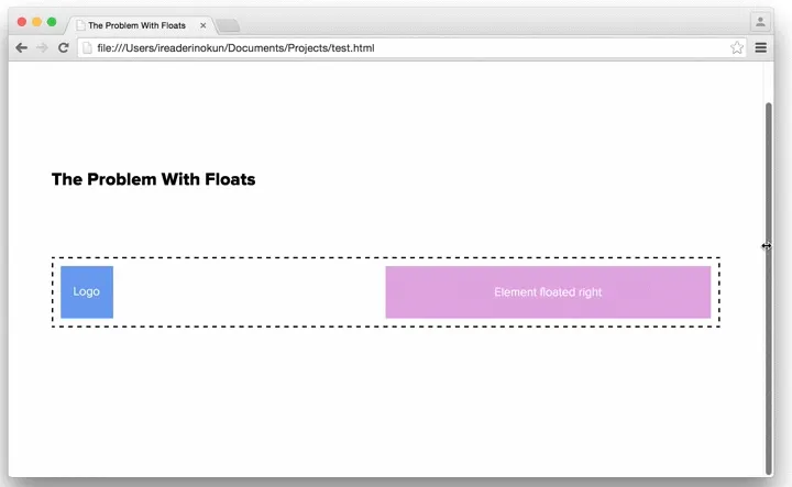
This happens because previously defined full-width elements push a floated element down
Although there are ways around this still using floats - for example also floating the logo element or rearranging the HTML so that the logo is defined after - they are not always suitable and so I tend to use an alternative.
The two property/value combinations I typically use as an alternative to floating are -
display: inline-blockposition: absolute
Here are two scenarios in which I use these alternatives (and one where I still use floats).
display: inline-block #
One of the popular uses for floats is in creating layouts. This is because you can quite easily have items perfectly aligned and span the full width of the parent element. For example -
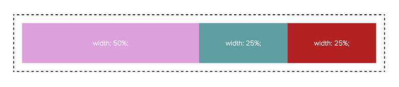
An alternative we can use to create this same effect is display: inline-block.
However, this alternative is not without its own issues. When an element is inline, extra spacing (about 3px) is added to the right of it. There are a few ways to get around this, and there is a great article outlining some of them on CSS tricks.
The solution I frequently use is to remove any whitespace in the HTML between the elements. This can be acheived using HTML comments. For example -
<div class="container">
  <div class="box">
    width: 50%;
  </div><!--
  --><div class="box">
    width: 25%;
  </div><!--
  --><div class="box">
    width: 25%;
  </div>
</div>
.box {
display: inline-block;
}Although this is definitely not a perfect solution, depending on the situation, it can be preferable to floating.
Position: Absolute #
Another scenario in which floats are used is when we want to align sibling elements on the same line both left and right. Because we want elements within the same parent to be aligned in opposite ways, we cannot simply use text-align: left or right on the parent element.
A typical example for this is a website header, in which we have the logo aligned to the left and the navigation aligned to the right.
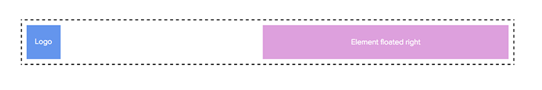
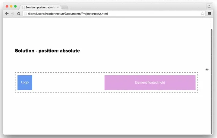
For this scenario, we can use position: absolute on one of the elements to align it in the other direction. For example -
@media screen and (min-width: 750px) {
  .logo {
    display: inline-block;
  }
  .right {
    position: absolute;
    top: 0;
    right: 0;
    width: 50%;
  }
}

@media screen and (max-width: 750px) {
  .logo {
    margin: 0 auto;
    display: block;
  }
  .right {
    position: relative;
    display: block;
    width: 100%;
  }
}
A Case For Floating #
Although these alternatives can cover most cases, there are still situations in which just sticking to floating can be better. The most common situation is when we want to have en element, typically an image, aligned left/right with text wrapping around. For example -
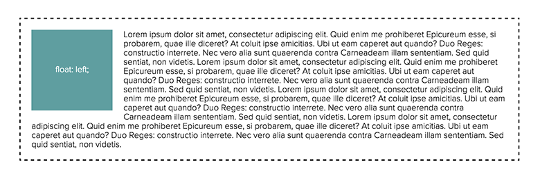
As far as I know, there is no simpler or better way to create this effect without floating. But also, an alternative isn't always necessary.