Controlling The Box Model
Every element in the document tree is is a rectangular box. The CSS box model is what describes these boxes and their components.
Box Model Basics #
Each rectangular box in an HTML document is made up of four areas - the content area, padding area, border area, and margin area. The perimeter of each of these areas is called it's "edge".
Consider this example -
<div class="box">
  <!-- start content area -->
  Lorem ipsum dolor sit amet.
  <!-- end content area -->
</div>
.box {
  width: 300px;
  height: 300px;

  padding: 50px; /* padding area */
  margin: 50px; /* margin area */
  border: 50px solid grey; /* border area */
}
Content Area #
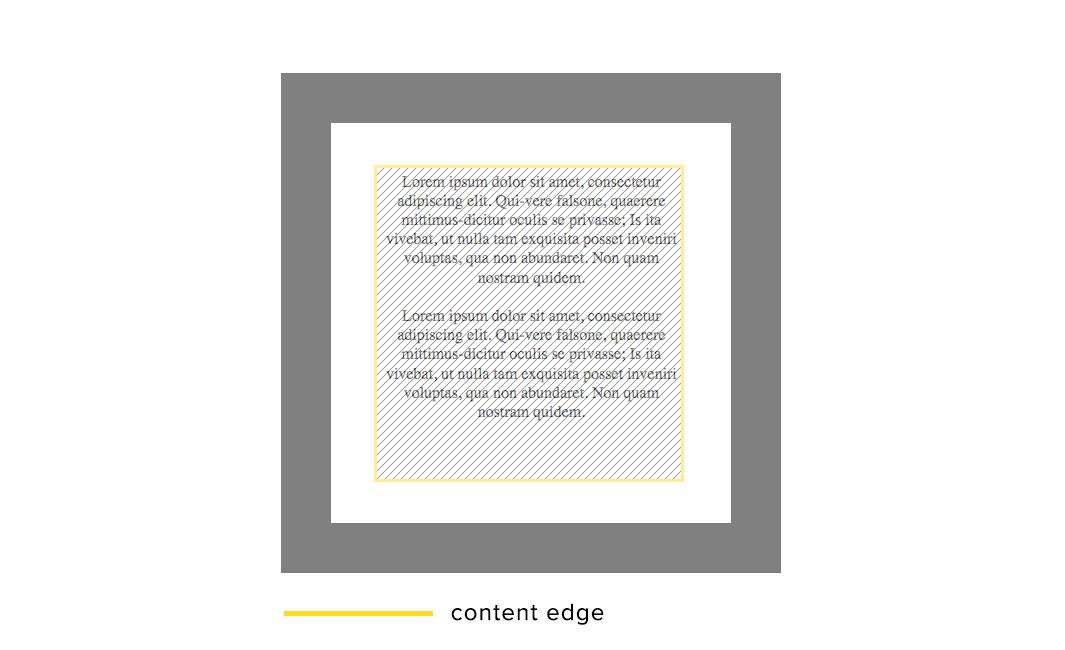
The content area is the area taken up by the actual content of the element. This can be the text, image or other media. It's edge is called the "content edge" or "inner edge".
Padding Area #
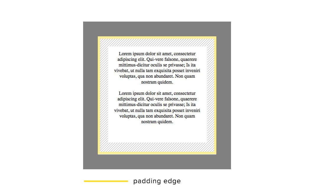
The padding area is the space we specify between the content and the border. It's edge is called the "padding edge".
Border Area #
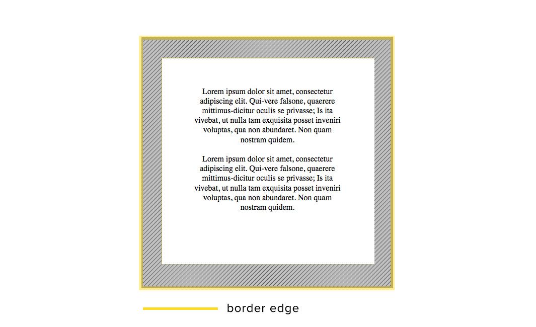
The border area is area taken up by the thickness of the border. Its edge is called the "border edge".
Margin Area #
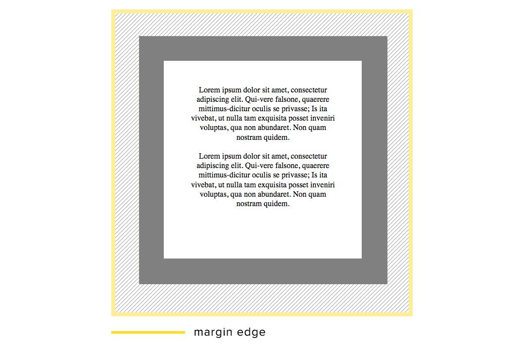
The margin area is the space outside the border. Although not strictly part of the element itself, it is included when we consider how much space on the page is taken up by the element. It's edge is called the "margin edge" or the "outer edge".
For block level elements, we are able to control the height and width of these rectangular boxes with the height and width css properties. However, given these disparate areas of each element, we have to specify what we mean by the" "width" or "height" of the element. This is where the box-sizing property comes in.
The Box-Sizing Property #
The box-sizing property defines which of the four edges we use to determine the width or height of an element. Depending on which area we specify, the content area may be adjusted accordingly.
The box-sizing property accepts four values - content-box, padding-box, border-box, and inherit. To highlight the difference between these, lets apply each of them to our .box example.
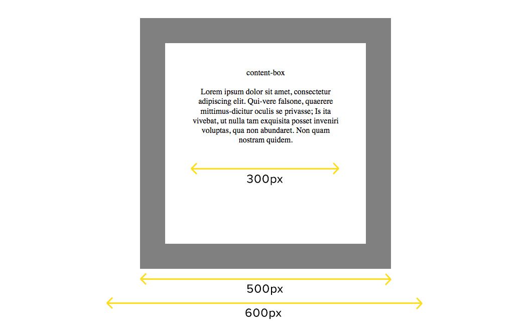
content-box #
width = content area
This is the default value. It sets the width of the element, in our case 300px, to be equal to the width of the content area.The thickness of the padding and border, therefore make the element wider than the 300px. The element width, in the more commonplace sense of the word, is now actually 500px, and the total amount of space taken up by the element is 600px.
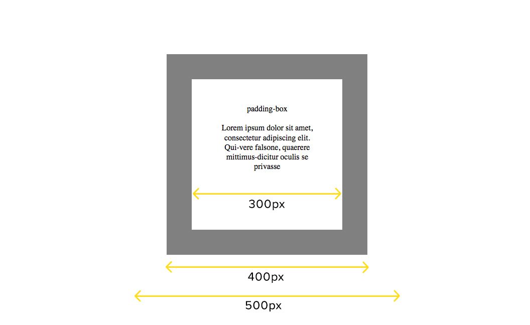
padding-box #
width = content area + padding area
This value includes the thickness of the padding in the calculation of the element width. The content area size is adjusted to a width of 200px to allow for this.
Note: This value is only supported in the Firefox browser. Other browsers will use the default, content-box if this value is set.
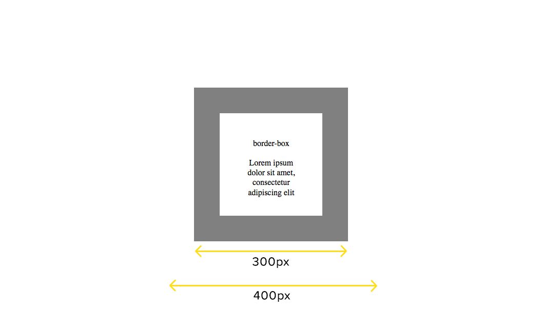
border-box #
width = content area + padding area + border area
This value includes both the padding and border size in the calculation of the element width. In this example, the width of the actual content area is now only 100px.
inherit #
This value sets the box-sizing to whichever value the parent element's box-sizing is set to.
Controlling The Box Model #
Which box sizing method you use really depends on what you prefer to think of has the element. For most people, and myself, using the border-box value is the most logical way of defining the element sizes.
To override the default content-box value, I always include this box sizing reset recommended by Paul Irish in my reset.css file -
html {
  /* Set border-box as the global default */
  box-sizing: border-box;
}

*, *:before, *:after {
  /* Allow each element to override */
  box-sizing: inherit;
}