CSS Grid Layout Terminology, Explained
In the CSS Grid Layout Specification, a grid is defined as the following -
The grid is an intersecting set of horizontal and vertical grid lines that divides the grid container’s space into grid areas, into which grid items (representing the grid container’s content) can be placed
Err… what? 🤔
CSS Grid Layout introduces a lot of new concepts; there are 17 new properties to learn, and many more new terms to understand. This can make getting started with CSS Grid Layout difficult, as new terms reference other terms and you can get into a spiral of confusion. So, here are the basic concepts and terminology of CSS Grid Layout, explained.
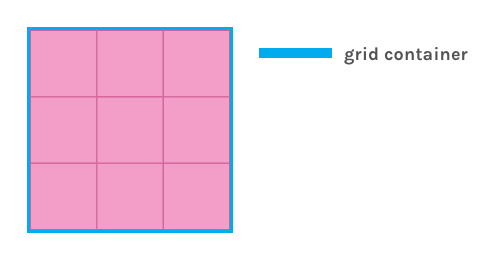
The Grid Container and Grid Items #
A Grid starts with the grid container. This, as it's name suggests, is the element that contains the elements of the grid. A grid container is created by setting the display property to any of the following values:
.grid-container {
    display: grid; /* Will create a block-level grid container */
    display: inline-grid; /* Will create an inline-level grid container */
    display: subgrid; /* Used on grid items that are also grid containers */
}
The grid container can be thought of like the flex container in the Flexible Box Layout Module (created with display: flex or display: inline-flex), or a basic Table (created with display: table or display: inline-table).
A grid container establishes a new grid formatting context for its child elements, which are now grid items. Special rules apply to grid items, for example -
- The
floatandclearproperties do not apply to grid items - The
vertical-alignproperty does not affect grid items - The
::first-lineand::first-letterpseudo-elements do not apply to the grid container
Grid Lines #
Grid lines are the horizontal and vertical lines which divide the grid. Each grid line has a referencing number, starting from the outer-most border of the grid container.
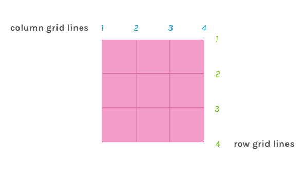
The grid line number is used when placing grid items within the container. We can specify that a grid item be placed at a specific grid line, or span one grid line to another.
.grid-container {
    display: grid;
    grid-template-columns: 100px 100px 100px;
    grid-template-rows: 100px 100px 100px;
}
.grid-item {
    grid-column: 2;
    grid-row-start: 1;
    grid-row-end: 3;
}
Grid lines can also be referenced by an author-given name. The example below will achieve the same result, but using named grid lines.
.grid-container {
    display: grid;
    grid-template-columns: 100px [grid-item-start] 100px [grid-item-end] 100px;
    grid-template-rows: [grid-item-start] 100px 100px [grid-item-end] 100px;
}
.grid-item {
    grid-column: grid-item-start / grid-item-end;
    grid-row-start: grid-item-start;
    grid-row-end: grid-item-end;
}
Grid Columns, Grid Rows, and Grid Tracks #
A grid column is the space between two adjacent vertical grid lines. The size of a grid column is determined by the grid-template-columns property. On the other hand, a grid row is the space between two adjacent horizontal grid lines. It's size is determined by the grid-template-rows property.
.grid-container {
    display: grid;
    grid-template-columns: 65px 1fr 65px;
    grid-template-rows: 100px 100px 100px;
}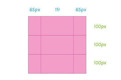
A grid track is a just generic term for either a grid column or a grid row.
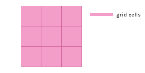
Grid Cells #
A grid cell is the intersection between a grid column and a grid row. It is a space bound by exactly four grid lines, which makes it the smallest available space within the grid.
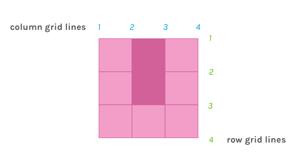
Grid Areas #
A Grid area is any area of space within the grid container that is bound by four grid lines. It must consist of at least one, but potentially more, adjacent grid cells. This means that all grid cells are also grid areas.
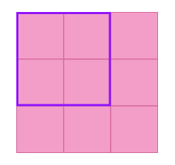
We can make an element a grid area by using the grid-area property, and assign that area to a space in the grid using the grid-template-areas property (or longhand grid-template-columns or grid-template-rows properties).
For example to assign the element, .outlined, to the space outlined in purple above, we can do this -
.outlined {
	grid-area: outlined;
	border: 2px solid purple;
}

.grid-container {
    display: grid;
    grid-template-areas: "outlined outlined ."
                         "outlined outlined ."
                         ". . .";
    grid-template-columns: 100px 100px 100px;
    grid-template-rows: 100px 100px 100px;
}
The Grid #
The grid itself is the sum of all these parts. Revisiting the definition from the start,
The grid is an intersecting set of horizontal and vertical grid lines that divides the grid container’s space into grid areas, into which grid items (representing the grid container’s content) can be placed
Hopefully, this definition is a little more clear!