FormHack.io - A Hackable CSS Form Reset
Dealing with forms can be a bit of a hassle. No matter how thorough I think I'm are being, if I am styling form elements from scratch, I am likely to miss out some vendor prefix that causes the field to be styled slightly differently on some browser.
This has always really frustrated me, so I decided to create a CSS reset for form elements called FormHack. FormHack is different from other CSS resets for two reasons -
- Its written in SASS/SCSS
- Its "hackable" - it isn't just a reset file, it allows you to make custom designs
FormHack works by providing a few variables that allow you to change some common attributes such as border-radius, input height/width, and colours. By changing these attributes, you get a form that is consistent across all major browsers without having to write it all by hand.
How it works #
FormHack is based on SASS, which, if you don't already know, is a CSS pre-processor. SASS allows you to add some awesome functionality to regular CSS such as creating variables and writing reusable functions.
With SASS variables I was able to create a settings section of the file. In this, I tried to extract the common attributes that I would vary from form to form and put them into these variables. This enables me to make significant design changes between forms by only changing those variables.
Here is the default settings example -
// Font
$fh-font-family: 'Raleway', sans-serif;
$fh-font-size: 16px;
$fh-font-color: rgb(40, 40, 40);

// Borders
$fh-border-radius: 5px;
$fh-border-width: 1px;
$fh-border-style: solid;
$fh-border-color: rgb(200, 200, 200);

// Inputs, Textareas, Select, Option
$fh-input-height: 40px;
$fh-input-width: 100%;
$fh-input-max-width: 400px;
$fh-input-bg-color: #fff;
$fh-focus-bg-color: rgb(220, 220, 220);
$fh-focus-border-color: $fh-border-color;
$fh-focus-font-color: $fh-font-color;

// Select Vendor Styling
$fh-allow-vendor-styling: true;

// Fieldset & Legend Styling
$fh-fieldset-bare: false;

// Buttons & Input Submits
$fh-button-height: 40px;
$fh-button-width: 100%;
$fh-button-max-width: 200px;
$fh-button-font-color: $fh-font-color;
$fh-button-bg-color: $fh-focus-bg-color;
$fh-button-hover-bg-color: $fh-border-color;
$fh-buton-hover-font-color: $fh-font-color;

// Layout
$fh-centered: false;
$fh-display: block;
You can see how these default settings render across different browsers from the FormHack website.
Cross Browser Frustrations #
Through creating this, I got into to all the nitty gritty differences between browsers when displaying form elements. Some of them were understandable, others not so much. Here are a few particularly strange nuances.
Inset Shadow on iOS #
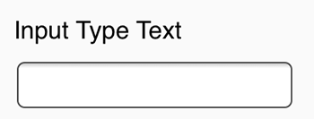
On almost all input and textarea elements, the Safari browser adds an inner shadow like so -

Although it is almost unnoticeable, it really bugged me because it remains even if you define the border around the element or set the inset shadow to none. Even though this only happens on Safari on iOS, the only way to remove this is to add -
input,
textarea {
  -webkit-appearance: none;
}
Input Type File #
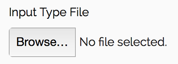
The file input type is probably the least customisable element across browsers. You can pretty much only style the background colour and border around it. However, if you set a height attribute on the element, Firefox styles it in a weird way -

Strangely, if you set a min-height attribute instead to the same value, it goes back to normal -

Select #
Styling the select element can be difficult. In some browsers, you have complete control over styling the border, border-radius, and background-color. In others, it is not so easy.
For example, the Safari browser by default adds a gradient background and curved borders on the element, which overrides any styling you set.

This can only be removed by setting -
select {
  -webkit-appearance: none;
}
However, doing so also gets rid of the arrow, which lets you know that it is a dropdown menu -

It also applies to the Chrome and Opera browsers, in which the styling is not so obtrusive. I haven't completed decided where I stand on whether it is a good idea for remove the arrows for accessibility reasons. Most of the time I opt to keep the arrows, which I think looks great on Chrome, but particularly ugly on iOS Safari. In FormHack, you can choose whether to keep the vendor styling in the settings section.
Those are just a few of the issues that come with styling forms. If you use FormHack or have any feedback on it, do let me know! You can leave a comment below or tweet me.
