The Holy Grail Layout with CSS Grid
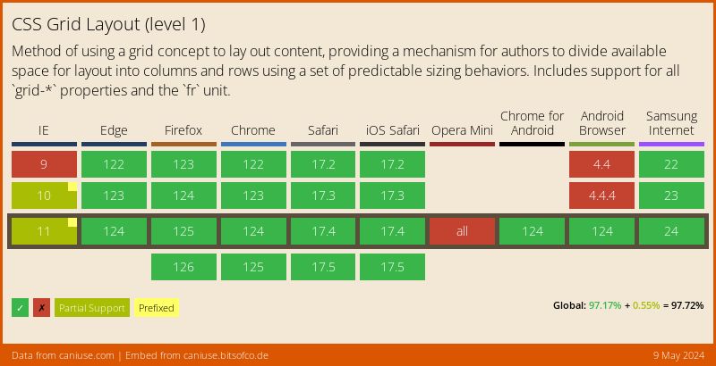
The CSS Grid Layout Module, although still in Editor's Draft, is nearing finalisation. We can now enable it in a number of browsers for testing and help figure out any bugs it may have.
The CSS Grid Layout is really complex, even more so than Flexbox. It has 17 new properties and introduces a lot of new concepts around the way we write css. So, in an attempt to wrap my head around this new specification and figure out how it works, I used it to create the Holy Grail Layout.
What's the Holy Grail Layout? #
The Holy Grail Layout is a web page layout that consists of four sections - a header, footer, and a main content area with two sidebars, one on each side. The layout also adheres to the following rules -
- Has a fluid center column width fixed-width sidebars
- The center column should appear first in the markup, before the two sidebars (but after the header)
- All three columns should be the same height, regardless of the content within them
- The footer should always be at the bottom of the browser viewport, even when the content doesn't fill up the height of the viewport
- The layout should be responsive, all the sections should collapse into one column on smaller viewports
It is famously difficult to create simply in CSS without any hacks.
The Solution with CSS Grid #
Here is the solution I came up with using the CSS Grid Layout. First, the markup -
<body class="hg">
  <header class="hg__header">Title</header>
  <main class="hg__main">Content</main>
  <aside class="hg__left">Menu</aside>
  <aside class="hg__right">Ads</aside>
  <footer class="hg__footer">Footer</footer>
</body>
And the CSS, at only 31 lines (expanded!) -
.hg__header { grid-area: header; }
.hg__footer { grid-area: footer; }
.hg__main { grid-area: main; }
.hg__left { grid-area: navigation; }
.hg__right { grid-area: ads; }

.hg {
	display: grid;
	grid-template-areas: "header header header"
	                     "navigation main ads"
	                     "footer footer footer";
	grid-template-columns: 150px 1fr 150px;
	grid-template-rows: 100px
						1fr
						30px;
	min-height: 100vh;
}

@media screen and (max-width: 600px) {
	.hg {
		grid-template-areas: "header"
		                     "navigation"
		                     "main"
		                     "ads"
		                     "footer";
		grid-template-columns: 100%;
		grid-template-rows: 100px
							50px
							1fr
							50px
							30px;
	}
}
Breaking it Down #
As I mentioned, CSS Grid Layout can be very complicated. However, for the purpose of creating this layout, I only used 4 of the 17 new properties -
grid-areagrid-template-areasgrid-template-columnsgrid-template-rows
My solution to the Holy Grail Layout using these CSS Grid properties can be broken down into five steps.
1. Defining the Grid #
The first thing we want to do is define the grid areas, so we can refer to them by this alias when creating the grid. We do this with the grid-area property.
.hg__header { grid-area: header; }
.hg__footer { grid-area: footer; }
.hg__main { grid-area: main; }
.hg__left { grid-area: navigation; }
.hg__right { grid-area: ads; }
Then, using the grid-template-areas property, we can specify the layout of the grid in a really intuitive and visual way. The grid-template-areas property accepts a space-separated list of strings. Each string represents a row. Within each string, we have a space-separated list of grid areas. Each grid area defined takes up one column. So if we want an area to span two columns, we define it twice.
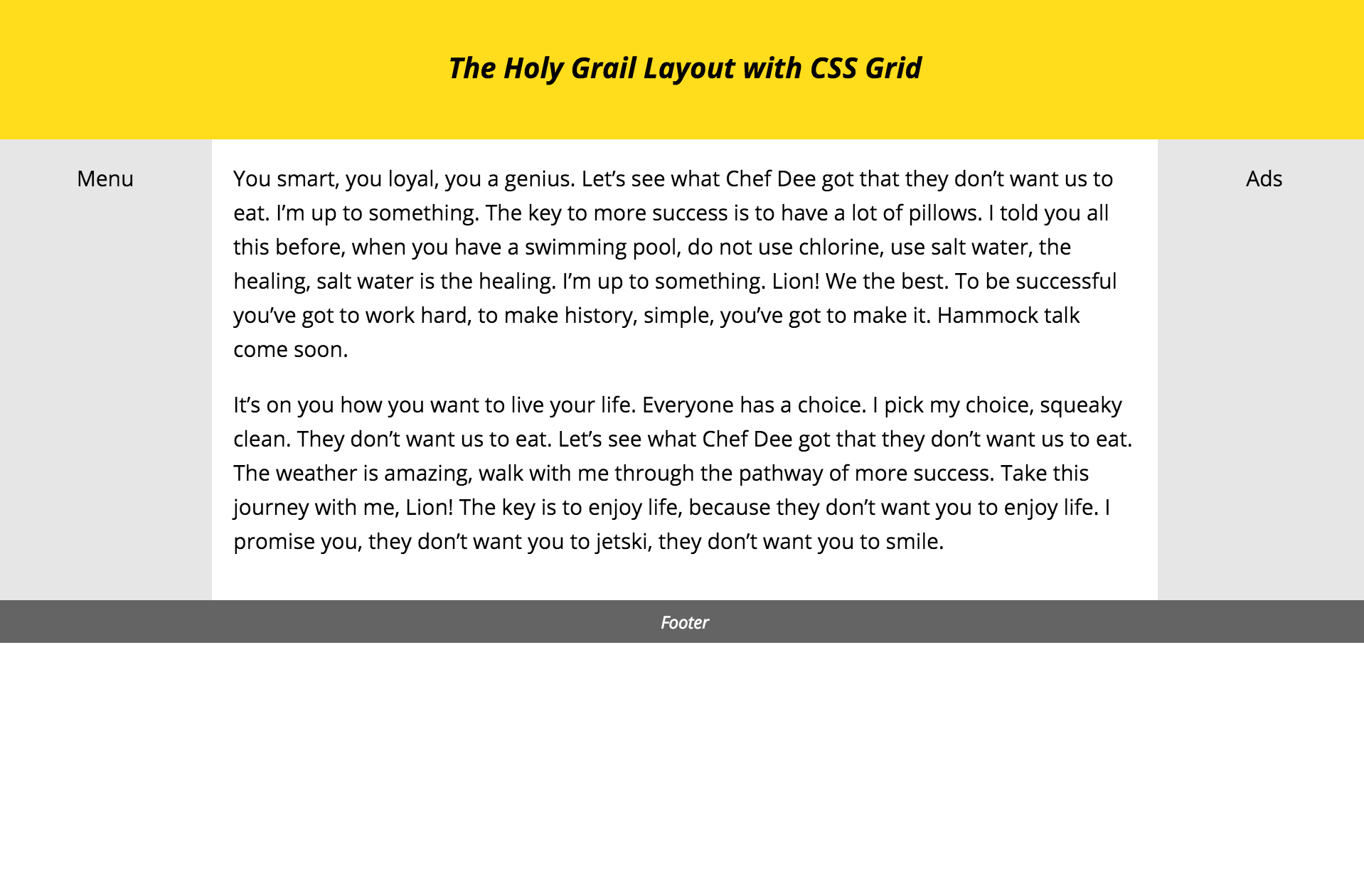
In our Holy Grail Layout, we have 3 columns and 3 rows. The header and footer rows span 3 columns, while the other areas span 1 column each.
.hg {
display: grid;
grid-template-areas: "header header header"
"navigation main ads"
"footer footer footer";
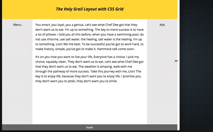
}With this markup, we get the following result.
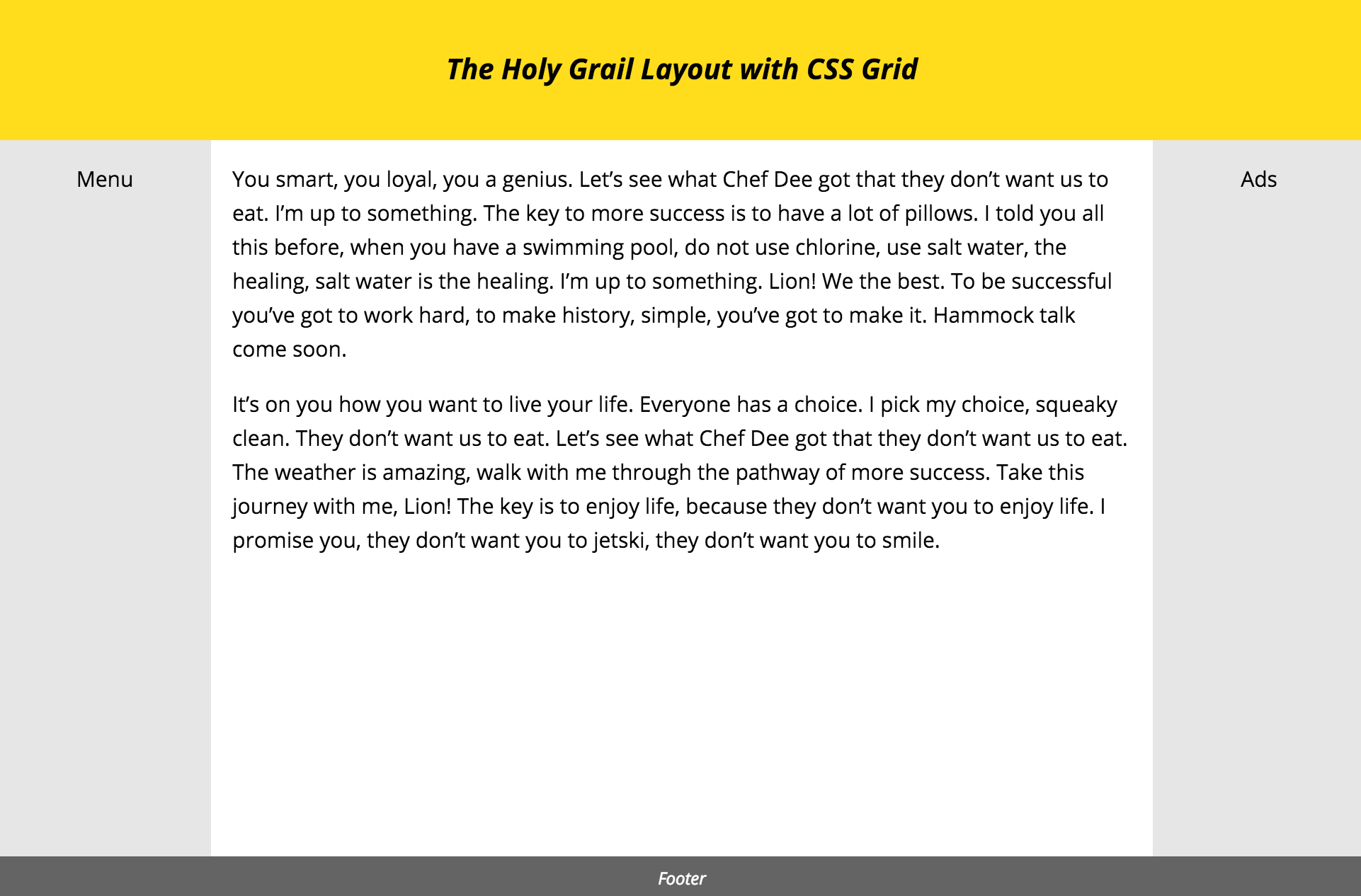
2. Defining Column Widths #
Next, we want to define the widths of the columns. We define the width of columns in our grid with the grid-template-columns property. This property accepts a space-separated list of widths, one for each column in the grid. Because we have 3 columns in our layout, we can specify 3 widths -
grid-template-columns: [column 1 width] [column 2 width] [column 3 width];For the Holy Grail Layout, we want the 2 sidebars to be 150px width each.
.hg {
  grid-template-columns: 150px  [column 2 width] 150px;
}
We also want the middle column to take up the rest of the space. We can do this by using the new fr unit. This unit represents a fraction of the free space left in the grid. In our case, this adds up to the current width of the grid minus 300px (the width of the two sidebars).
.hg {
grid-template-columns: 150px 1fr 150px;
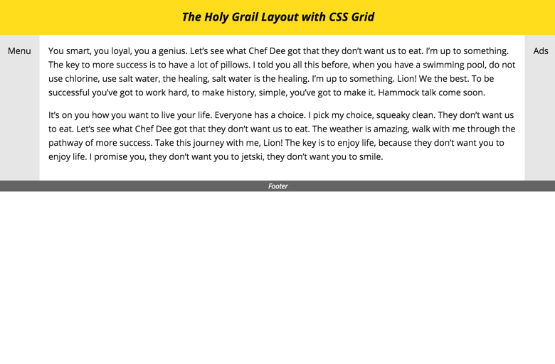
}After setting the grid columns, this is what the layout looks like -
3. Defining Row Heights #
Next, we want to define the heights of the rows. Similar to how we define the column widths with grid-template-columns, we define the row heights with grid-template-rows. This property also accepts a space-separated list of heights for each row in our grid. Although we can write it on one line, I think it's nicer and more visually clear to write it one row per line.
.hg {
	grid-template-rows: 100px
						1fr
						30px;
}
So our header height is 100px, our footer height is 30px, and the middle row (with the main content and two sidebars) takes up the rest of the available space in the .hg element.
4. Sticky Footer #
In the Holy Grail Layout, we want the footer to always be at the bottom of the viewport, even if the content on the page is sparse. To achieve this, we can set a minimum height on the .hg element to be the height of the viewport.
.hg {
min-height: 100vh;
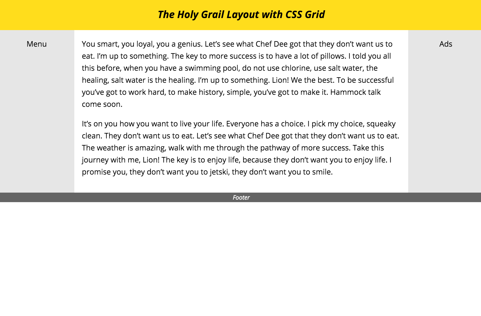
}Because we specified that the middle row should fill up the rest of the available space, it stretches to fill the screen.
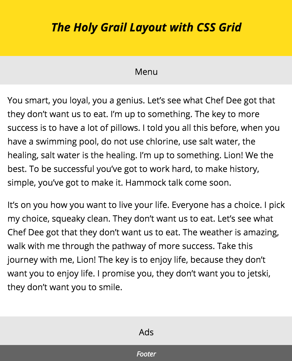
5. Making it Responsive #
Finally, we want to make the layout responsive. On smaller devices, all the grid items should be displayed in a single column, one after the other. To do this, we need to redefine the 3 properties we defined before - grid-template-areas, grid-template-columns and grid-template-rows.
First, we want all the items in the grid to be in one column, in a particular order -
@media screen and (max-width: 600px) {
	.hg {
		grid-template-areas: "header"
		                     "navigation"
		                     "main"
		                     "ads"
		                     "footer";
	}
}
Next, we want all items to span the full width of the grid -
@media screen and (max-width: 600px) {
	.hg {
		grid-template-columns: 100%;
	}
}
Finally, we need to reset the heights of each of the rows. All rows, besides the main row, have a defined height -
@media screen and (max-width: 600px) {
	.hg {
		grid-template-rows: 100px /* Header */
							50px /* Navigation */
							1fr /* Main Content */
							50px /* Ads */
							30px; /* Footer */
	}
}
And that's it! You can check out a demo of this here, as well as the source (nb: you may need to enable experimental web features in your browser to see it).
Support #