How the minmax() Function Works
One incredibly useful new feature introduced with the CSS Grid Layout Specification is the minmax() function. This function opens the door to us being able to write much more powerful and succinct CSS by allowing us to set, as a value for a grid track, a function including both a minimum and maximum value.
The minmax() Function #
The minmax() function accepts two parameters, a minimum value and a maximum value.
minmax(min, max)If the maximum value defined is actually less than the minimum, it is ignored, and the function is treated as purely presenting a minimum value.
The minmax() function accepts 6 types of value:
- Length
- Percentage
- Flexible Length
max-contentmin-contentauto
Let’s consider examples of each.
Length #
Perhaps the most simple value we can use with the minmax() function is a basic length. Take, for example, this simple grid, which has three columns and a single row.

Using the minmax() function, we can specify that the yellow grid cell remain between 100px and 200px. As the viewport is resized, the absolute value will change, but always within these two limits.
.grid {
    display: grid;
    grid-template-columns: minmax(100px, 200px) 1fr 1fr;
}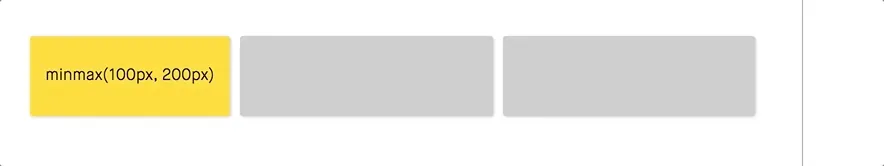
The second and third columns shrink and expand to fill the remaining available space equally, but the first column always remains between 100px and 200px wide.
Percentage #
Besides the basic length units, we can also use percentage units with the minmax() function. Say, for example, that we want the yellow grid cell to take up a maximum of 50% of the grid, but not get any smaller than 200px.
.grid {
    display: grid;
    grid-template-columns: minmax(200px, 50%) 1fr 1fr;
}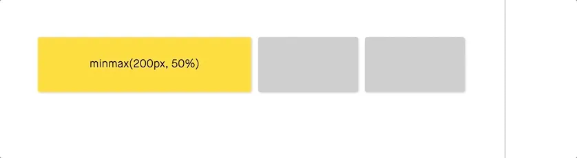
No matter how small we shrink the viewport, the yellow cell never gets smaller than 200px. But, when it has the room to, is grows to a maximum of half the grid width.
Flexible Length #
The Flexible Length is a new unit which, like the minmax() function, was also introduced with the CSS Grid Layout Specification. This length, which uses the fr unit, represents a fraction of the free space in the grid container. For example, let’s say we have a 100px-wide grid, with 2 columns. One column has a fixed width of 20px and the other column has a width of 1fr. The second column will effectively have a width of 80px, as it takes up the remaining available space within the grid.
Currently, the fr unit can only be used as the maximum value in the minmax() function (although it is noted in the spec that, in the future, it may be applicable to the minimum value as well). Going back to our example, we can specify that we want the yellow grid cell to be a minimum of 200px. If the viewport is resized larger than that, we want the cell to be 1fr, the same size as the other two columns.
.grid {
    display: grid;
    grid-template-columns: minmax(200px, 1fr) 1fr 1fr;
}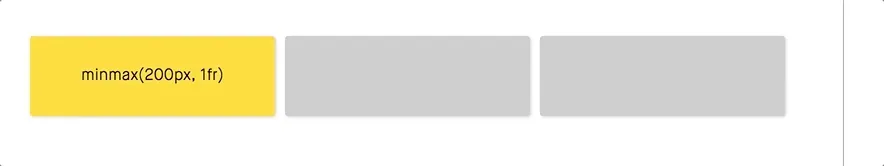
Since all columns are 1fr at larger viewport sizes, they share an equal amount of space within the grid.
max-content #
The max-content keyword is a special value that represents the cell’s "ideal size". This is the smallest possible size the cell can be, while still fitting around it’s contents unobtrusively. For example, if the contents of the cell is a sentence, the ideal width for the cell will be to take up the entire length of the sentence, regardless of the length and no line breaks.
Taking our previous example, let’s specify that the yellow grid cell be both a minimum and maximum of max-content.
.grid {
    display: grid;
    grid-template-columns: minmax(max-content, max-content) 1fr 1fr;
}
As we can see, the size of the column expands to fit the entire length of the string. Since both the minimum and maximum values are set to max-content, the width of the column remains the same.
min-content #
The min-content keyword, like max-content, is a special value. It represents the smallest possible size the cell can be that does not lead to an overflow, unless that overflow is unavoidable.
To illustrate the difference between min-content and max-content, we can use the same content as in the previous example, but set both values of the minmax() function to min-content.
.grid {
    display: grid;
    grid-template-columns: minmax(min-content, min-content) 1fr 1fr;
}
We can see that the content within the cell is shifted in order to take up the least amount of horizontal space possible, without causing any overflow.
auto #
Finally, we have auto. This has different meanings depending on if it is used as the maximum or minimum value in the minmax() function.
If used as a maximum, the auto value is equivalent to the max-content value. If used as a minimum, the auto value represents the largest minimum size the cell can be. This "largest minimum size" is different from the min-content value, and specified by min-width/min-height.
To illustrate this, here's what happens when the yellow grid cell in our example is set to an auto minimum and maximum.
.grid {
    display: grid;
    grid-template-columns: minmax(auto, auto) 1fr 1fr;
}
Using the minmax() Function: Responsive Design without Media Queries #
As we have seen, there are several cases where using the minmax() function is suitable, and we can use it in several ways. But perhaps the most popular and useful case for the minmax() function it's ability to enable us create responsive designs without the use of any media queries.
Let's take this example grid:

Each column in the grid has a minimum width of 200px. As the viewport is resized, the number of columns changes to fit their ideal width. With CSS Grid and the minmax() function, this can be created in as little as 2 lines of CSS -
.grid {
    display: grid;
    grid-template-columns: repeat(auto-fit, minmax(200px, 1fr));
}
Besides the minmax() function, there are two other key parts to this:
repeat(): This function allows us to specify the same value for multiple columns in the grid. It accepts two values: the number of times to repeat, and the value to be repeated.auto-fit: This keyword can be used with therepeat()function instead a number of times to repeat. This will flexibly change the number of columns that are used based on the width each column can be.
One, in my opinion quite major, limitation of this technique, however, is that it only works when each column is of equal width. We have to use the repeat() function with the auto-fit keyword, as this is what allows the number of columns to be flexible. Nonetheless, this can still an extremely useful technique in the right circumstances.