Making the abbr element work for touchscreen, keyboard, and mouse
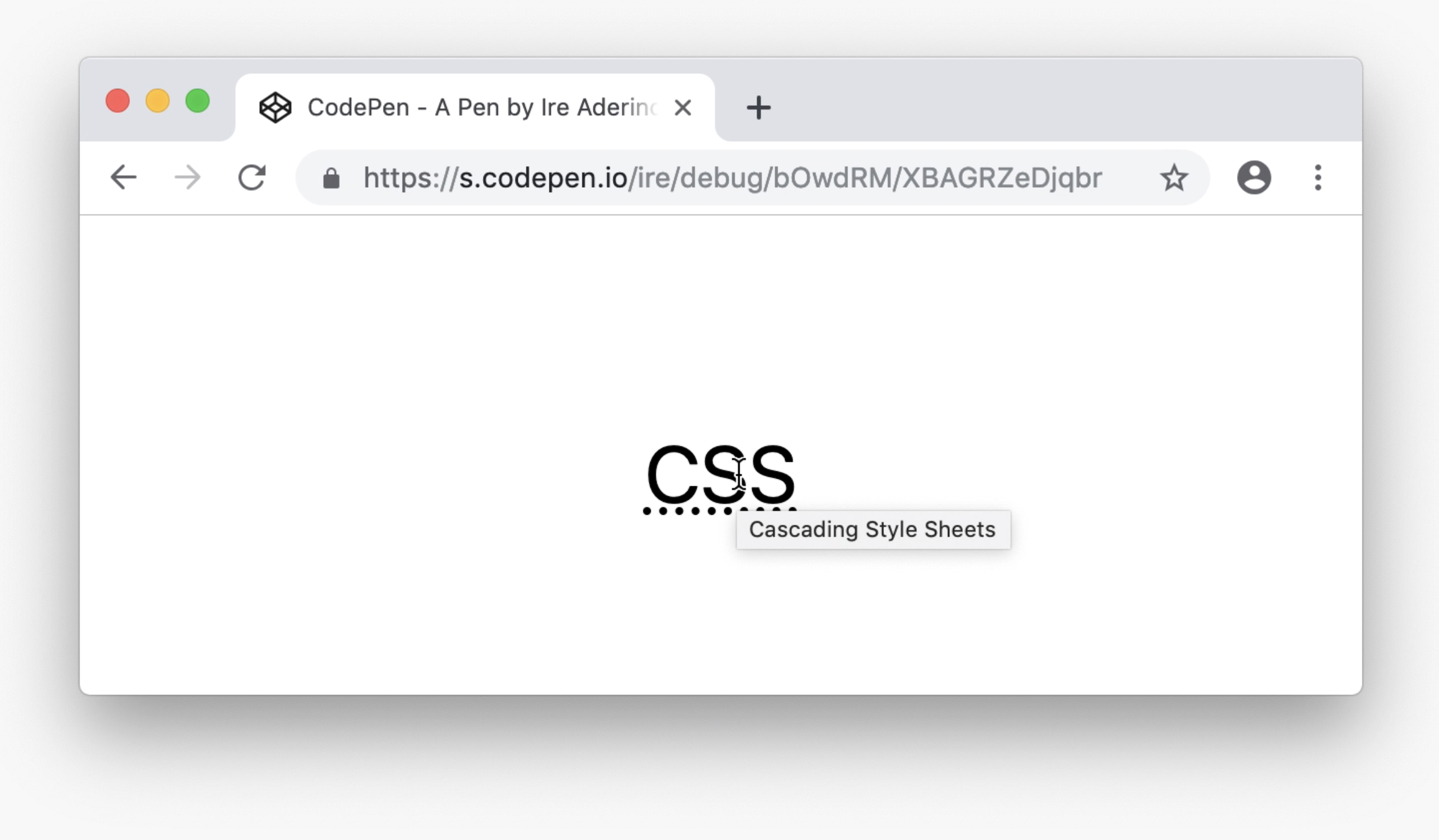
The <abbr> element is used to denote and define an acronym. For example, if we want to write the acronym “CSS” anywhere on a web page, we can also provide the full name “Cascading Style Sheets” for readers unfamiliar with the acronym.
This is done by wrapping the acronym in an <abbr> element and adding the full definition in a title attribute.
<abbr title="Cascading Style Sheets">CSS</abbr>If a user hovers their mouse over the acronym, the full definition is displayed in a native browser tooltip.
The problem(s) with the abbr element #
The <abbr> element works well enough on desktop devices as long as the user is interacting with a pointing device. However, it fails for users who are interacting with the page via the keyboard or a touchscreen device. This is because of two things:
- The
<abbr>element isn’t able to be brought into focus, e.g. by a keyboard user pressing the tab key - Mobile browsers don’t display the tooltip on any interaction from the user
Additionally, I’ve always thought the delay before the native browser tooltip shows up was too long. It takes about 2 seconds, which is really slow compared to most other interactions on the web.
Fixing the abbr element #
These issues can be fixed by modifying the HTML and adding some custom styles to re-implement the native browser tooltip in a more effective way.
Enabling focus #
The first thing we need to do is allow the <abbr> element to be brought into focus to enable keyboard users to interact with it. We can do this by adding the tabindex attribute to the element.
<abbr title="Cascading Style Sheets" tabindex="0">CSS</abbr>A tabindex value of 0 will place the element in the default focus order as determined by the element’s position in the HTML document.
Displaying the title element #
Next, we need a way to display the contents of the title element to the user. This can be done by using the attr() function, which allows us to retrieve and use the contents of any element’s attribute as a CSS value.
For example, we can take the title of the <abbr> and display it immediately after the element in an ::after pseudo-element.
abbr[title]::after {
  content: attr(title);
}
Showing the custom tooltip on mouse hover, keyboard focus, or finger tap #
Although we can leave it at displaying the title of the <abbr> element immediately after it, our goal here is to recreate a tooltip. So, instead of just plainly displaying the title by default, we can wait for the user interaction we want first.
In order to have the custom tooltip display in the three scenarios we want - mouse hover, keyboard focus, or finger tap - we need to combine the display of the pseudo-element with both the :hover and :focus pseudo-classes.
abbr[title]:hover::after,
abbr[title]:focus::after {
  content: attr(title);
}
The :hover pseudo-class takes care of when the user hovers over the device with a mouse, but also when the user taps on the element on a touchscreen device. Additionally, unlike the :focus or :active pseudo-classes, the :hover pseudo-class works on all mobile browsers, including mobile Safari.
The :focus pseudo-class takes care of when the user brings the element into focus via their keyboard. With the tabindex attribute we added, this is now possible for users to do.
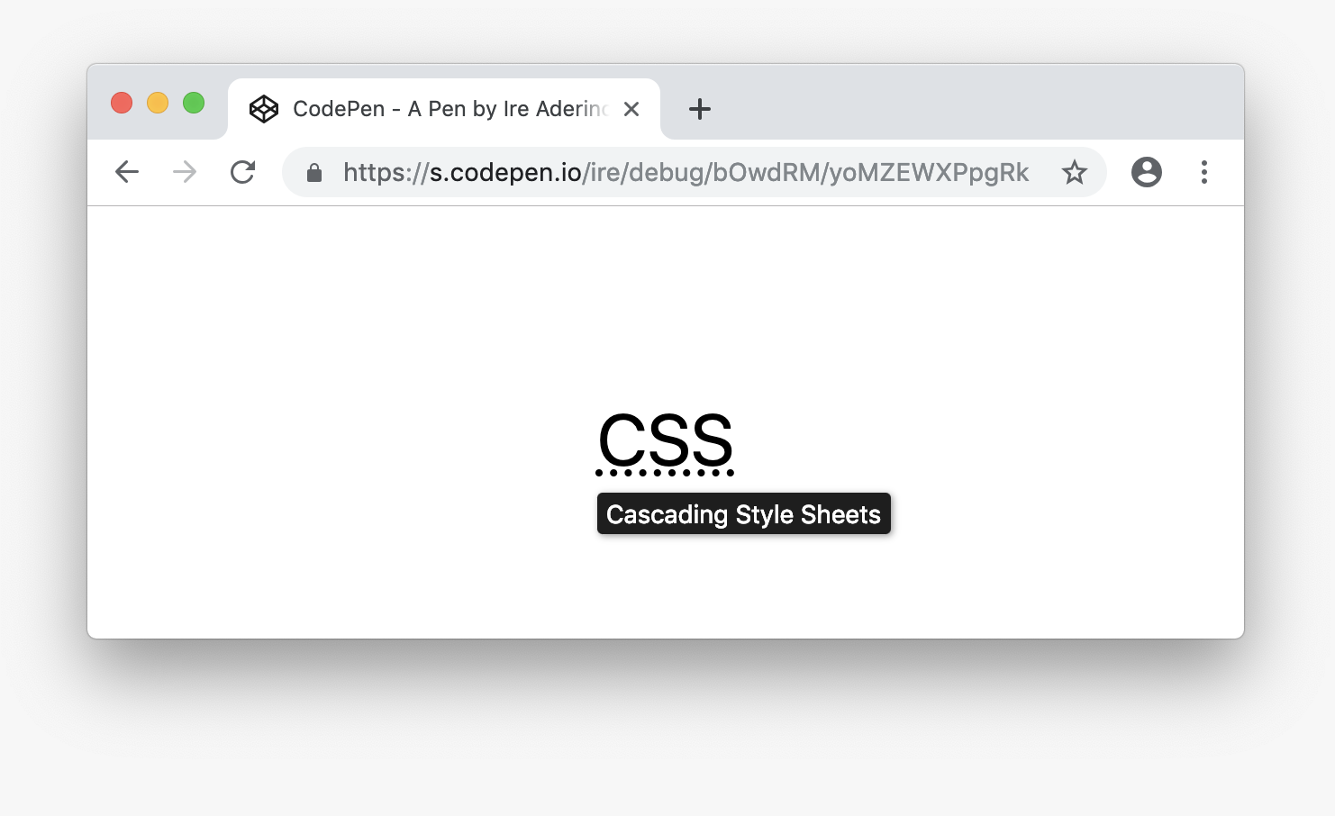
Styling the tooltip #
Finally, we can add more styles to make the tooltip appear as a tooltip, and not just as text next to the element.
abbr[title] {
  position: relative;

  /* ensure consistent styling across browsers */
  text-decoration: underline dotted;
}

abbr[title]:hover::after,
abbr[title]:focus::after {
  content: attr(title);

  /* position tooltip like the native one */
  position: absolute;
  left: 0;
  bottom: -30px;
  width: auto;
  white-space: nowrap;

  /* style tooltip */
  background-color: #1e1e1e;
  color: #fff;
  border-radius: 3px;
  box-shadow: 1px 1px 5px 0 rgba(0,0,0,0.4);
  font-size: 14px;
  padding: 3px 5px;
}
And that’s it! Here's what it would look like when active:
You can also checkout the codepen I created to demo this.