Redesigning bitsofcode
Welcome to the new bitsofcode! Since launching this blog over 2 years ago, I’ve had two designs, this being the third.
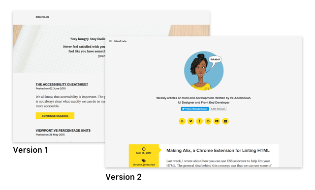
You can check out the first and second designs using the WayBack Machine. The first one looks particularly embarrassing... Anyway, I thought I would share here my process in this redesign and rebuild.
A Logo (Finally) #
Over the past two years, I haven’t really had a solid visual identity for bitsofcode. Besides the yellow colour, there hasn’t been any other identifiable asset for the blog. This hasn't been for lack of trying, I had attempted to design a logo myself on several occasions, but never ended up with anything I actually liked. In the end, I just decided to hire someone, in this case the amazing designer Seyi Olusanya, and the bitsofcode logo was born.

I think Seyi did really well in embodying the personality of the blog. He also had the idea to create a fun animation with the logo, and came up with this -
I decided to implement a part of that video as a CSS animation. If you haven't already noticed, the animation is activated when users interact with the logo in the header. I plan on writing about how I created the CSS animation in more detail in a later article.
Design Decisions #
Despite the resultantly simple design, I spent a lot of time on the redesign. There were a couple decisions I particularly dwelled on.
How to use the theme colour? #
In my previous design, I had used the theme colour, #FFDB3C, a lot more, particularly on the home page. In this design, I wanted the yellow to be more of an accent, rather than a primary colour.
I played around with many different ways of having the yellow be an accent, before eventually settling with having a yellow border around the entire page, and using it for highlights in certain cases. I also created a custom code highlighting theme, in which I made use of the yellow as the primary colour.
To hamburger or not to hamburger? #
How to handle the navigation was a question I fought with for a while. I had used the hamburger menu in my last design, mainly because the navigation wasn't that important. The most important item on the menu was home, which could also be accessed through the logo.
I decided to use the hamburger menu again for a few reasons. First, like in the previous design, the contents of the menu don't seem that important. People access articles through the page content, not through the menu. Second, I felt like the other design decisions I had made left it the best choice. For example, I wanted the logo to be in the middle, which didn't leave much space for a full menu in the header as well.
So, although the hamburger menu definitely has it's shortcomings, I felt it was the best option for this particular case.
Performance Improvements #
A major reason I wanted to redesign (and, more importantly, rebuild) the site was because I felt I could make a lot of improvements performance-wise. Over the past year in particular, I've researched into and written a decent amount about performance, yet hadn't really implemented that knowledge on this site itself.
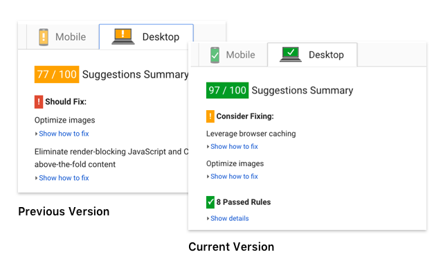
Overall, the changes I made have been a decent improvement. My score on PageSpeed Insights went from 77 to 97 on Desktop (70 to 96 on Mobile).
To achieve this, I made the following optimisations.
Use System Fonts #
In my last design, 33.8% of bytes downloaded were from fonts alone. This was clearly an area ripe for improvement. In this revamp, I cut that down to zero by using System Fonts instead. For the Sans-Serif font, which is used for the majority of the site, I used the same system font stack used by Wordpress -
p {
    font-family: -apple-system,
                 BlinkMacSystemFont,
                 "Segoe UI",
                 Roboto,
                 Oxygen-Sans,
                 Ubuntu,
                 Cantarell,
                 "Helvetica Neue",
                 sans-serif;
}
For the Monospace font used in code samples, I put together my own stack based on fonts I liked -
code {
font-family: "Inconsolata",
Consolas,
Monaco,
"Andale Mono",
"Ubuntu Mono",
monospace;
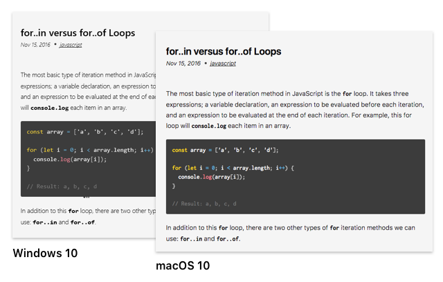
}This is what a typical article looks like on Mac versus Windows -
Reduce Assets / Dependencies #
In addition to cutting out Google fonts, I was able to improve performance by cutting down on assets I didn’t really need to be using. In particular, I was able to cut the following:
- Font Awesome Icon Fonts: Instead, I use SVG for all icons.
- jQuery: I was barely even using jQuery in the previous design, so this was pretty easy to cut out and reimplement the logic in plain JavaScript.
On the flipside, I had to add some new dependencies due to the addition of Carbon ads on the site. However, there was still a net decrease in assets being loaded.
Optimize CSS Delivery #
A major improvement I made was to optimise the delivery of the main styles of the page. A pretty common “Should Fix” message many sites get on PageSpeed Insights is the following:
Eliminate render-blocking JavaScript and CSS in above-the-fold content. None of the above-the-fold content on your page could be rendered without waiting for the following resources to load. Try to defer or asynchronously load blocking resources, or inline the critical portions of those resources directly in the HTML
The way to fix this is by having some critical CSS directly in our document <head>. Then, once the page has been loaded and is rendering on the page, use JavaScript to fetch and insert the full CSS file. I used the loadCSS library to help do this. To generate the critical CSS, I used a postCSS plugin I created and am testing out (more on that later!).
The <head> of the document now looks something like this -
<head>
    <meta charset="utf-8">
    <title>bitsofcode</title>

    <!-- loadCSS library -->
    <script >
		// https://github.com/filamentgroup/loadCSS
		!function(e){"use strict";var n=function(n,t,o){function i(e){return a.body?e():void setTimeout(function(){i(e)})}function r(){l.addEventListener&&l.removeEventListener("load",r),l.media=o||"all"}var d,a=e.document,l=a.createElement("link");if(t)d=t;else{var s=(a.body||a.getElementsByTagName("head")[0]).childNodes;d=s[s.length-1]}var f=a.styleSheets;l.rel="stylesheet",l.href=n,l.media="only x",i(function(){d.parentNode.insertBefore(l,t?d:d.nextSibling)});var u=function(e){for(var n=l.href,t=f.length;t--;)if(f[t].href===n)return e();setTimeout(function(){u(e)})};return l.addEventListener&&l.addEventListener("load",r),l.onloadcssdefined=u,u(r),l};"undefined"!=typeof exports?exports.loadCSS=n:e.loadCSS=n}("undefined"!=typeof global?global:this);
    </script>

    <!-- Critical CSS -->
    <style id="inlineCSS">
		.site__nav ul{ display:flex;flex-wrap:wrap; }
		/* More critical CSS */
    </style>

    <!-- If JavaScript is not enabled, just include the full CSS file like normal -->
    <noscript><link rel="stylesheet" href="/assets/css/main.css"></noscript>

    <!-- Otherwise, call loadCSS function -->
    <script id="loadCSS">loadCSS("/assets/css/main.css");</script>
</head>
Unfortunately, since I’m hosting with Ghost, I don’t have complete control over what is in my document <head>. So, because Ghost inserts some more externally sourced CSS files in my document <head>, my PageSpeed Insights score isn’t as great as it could be.
shrugs
What's Next? #
Although this new design is an improvement on the previous one in a number of ways, there is definitely still room for more improvement. As I learn more, I will like to make incremental changes as I go.
I'd also appreciate any feedback, comments, or suggests I can get. I could only do so much testing myself, so if you are experiencing any issues on the site, do leave a comment.
✌🏾