The Accessibility Cheatsheet
We all know that accessibility is important. The problem is, it is not always clear what exactly we can do to make our sites more accessible.
The Web Accessibility Initiative created some Web Content Accessibility Guidelines (WCAG) targeted at us, web content developers, to create more accessible websites. The WCAG contain some very useful information, and so I decided to condense the very extensive guidelines and highlight some practical examples of what we can do to implement them and make our websites more accessible.
Overview #
The guidelines for accessible content have four overarching principles, each with more specific guidelines. You can click on the link to go to the relevant section of this article.
- 1 - "Perceivable" - Information and user interface components must be presentable to users in ways they can perceive.
- 2 - "Operable" - User interface components and navigation must be operable.
- 3 - "Understandable" - Information and the operation of user interface must be understandable.
- 4 - "Robust" - Content must be robust enough that it can be interpreted reliably by a wide variety of user agents, including assistive technologies.
- 4.1 - Compatible
Principle 1 - "Perceivable" #
1.1 Text alternatives #
"All non-text content that is presented to the user has a text alternative that serves the equivalent purpose"
Plain text is the optimal format for any piece of content. This is because it can be used in many different formats to suit individuals with different disabilities. Therefore, it is important to provide a plain text alternative format for all content that is informative, i.e. not just decorative.
For images, use the alt attribute. The alternative text for an image should be as descriptive as possible, such that the same message is conveyed.
<img src="newsletter.gif" alt="Free newsletter. Get free recipes, news, and more." />For audio and video elements, provide text transcripts. You can use the track element to specify timed text tracks for these media elements.
<!-- Format of the track element -->
<track kind="subtitles | captions | descriptions" src="path/to/file.vtt" srclang="" label="">

<!-- Example caption for an audio file -->
<audio controls>
  <source src="myaudio.ogg" type="audio/ogg">
  <track src="caption_en.vtt" kind="captions" srclang="en" label="English">
</audio>

<!-- Example descriptions of a video file in English and German -->
<video poster="myvideo.png" controls>
  <source src="myvideo.mp4" srclang="en" type="video/mp4">
  <track src="description_en.vtt" kind="descriptions" srclang="en" label="English">
  <track src="description_de.vtt" kind="descriptions" srclang="de" label="German">
</video>
For user interface elements, use labels. Labels can be used to provide context for information that may be otherwise very clear visualy. For example, where you may have a primary and secondary navigation that is styled differently, you use aria-label to distinguish between them.
<div role="navigation" aria-label="Primary">
  <ul><li>...a list of links here ...</li></ul>
</div>
<div role="navigation" aria-label="Secondary">
  <ul><li>...a list of links here ...</li> </ul>
</div>
1.2 Alternatives for time-based media #
"Provide alternatives for time-based media."
Time-based media (audio and video) can be especially difficult for individuals with hearing or vision difficulties. In addition to providing a plain text alternative, it may also be helpful to provide an alternative time-based media version. For example -
- Sign language as part of a video file
- Alternative audio for video files
- Video file with sign language as alternative for audio files
1.3 Adaptable Content #
"Create content that can be presented in different ways (for example simpler layout) without losing information or structure."
Write your HTML in a meaningful sequence. Your document should be readable and understandable without any CSS. Lay out your HTML the way the page is inteaded to be read and, where possible, make use of semantic markup.
<header>
  <h1>Site Title</h1>
  <nav><!-- links --></nav>
</header>
<main>
  <h1>Page Title</h1>

  <section>
  <h2>Section Title</h2>
  <p>Lorem ipsum dolor sit amet, <strong>consectetur</strong> adipiscing elit. Pauca mutat vel plura sane;
  Vide, quantum, inquam, fallare, Torquate. Iam in altera philosophiae parte.</p>
  </section>
</main>
<footer>
  <!-- Site credit -->
</footer>
Meaningful information should not be conveyed solely via sensory characteristics. Sensory characteristics such as shape, size, visual location, orientation, or sound should not be the only way of conveying important information.
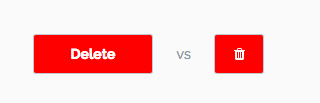
If you want to convey that a button will delete content, for example, make sure that this is also written in text, as shown on the left. Do not rely solely on colour and icons, as shown on right.
1.4 Distinguishable #
"Make it easier for users to see and hear content including separating foreground from background."
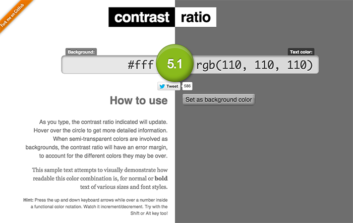
Contrast ratio of text to background should be at least 4.5:1, preferably 7:1. You can use Lea Verou's app to find the contrast ratio of your site's colours.
Text should be easily resizable. Text should be resizable using the default browser mechanisms up to 200% without a loss of content or functionality.
Use actual text instead of images of text. As mentioned before, plain text is the most accessible format to use. Therefore, it is counterintuitive to use images of text where plain text can be used.
Control over audio media should be provided. If any audio is played on a web page, provide a mechanism for users to control it with pause/play buttons and volume controls independent of the system volume controls.
Principle 2 - "Operable" #
2.1 Keyboard accessible #
"Make all functionality available from a keyboard."
Many people are unable to navigate the web using a mouse. Therefore, all functionality should be operable through the standard keyboard interface without requiring specific timings for individual keys.
Ensure all functional elements have a clear focus state. For people navigating a website using the tab key only, focus states are how they know their location on the page. You can use javascript to add keyboard accessibility to static elements if needed.
Avoid keyboard traps. Tab through the content of your website from start to finish to ensure that the keyboard focus is not trapped on any of the content.
2.2 Enough time #
"Provide users enough time to read and use content."
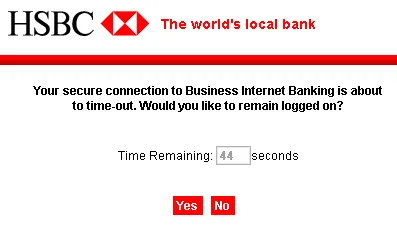
Provide controls for timed content. For any interactions related to timing - including moving information, auto-updating, or page time-outs - you should implement at least one of the following safeguards -
- Users can turn off the time limiit
- Users can adjust time limit to at least 10 times the length of the default setting
- Users is warned before time expires and given at least 20 seconds to extend the time limit with a simple action
2.3 Seizures #
"Do not design content in a way that is known to cause seizures."
Flashing light should not occur more than three times per second. Or, the flash should be below the general flash and red flash thresholds. You can use photosensitive epilepsy analysis tools or flash tests to test your site if you are unsure.
2.4 Navigable #
"Provide ways to help users navigate, find content, and determine where they are."
Provide a link for users to skip to the page's main content. One of the first links on every page of a website should include a link for users to bypass repeated blocks of content, such as the navigation. This is especially important for pages that have large, multi-layered navigation menus. The link itself does not need to be visible when out of focus. For example -
<head>
  <style>
    #skip_to {
      position: fixed;
      left: 0;
      top: 0;
      opacity: 0;
    }
    #skip_to:focus {
      opacity: 1;
    }
  </style>
</head>
<body>
    <a href="#main_content" id="skip_to">Skip to Main Content</a>

    <nav> <!-- Navigations links here --> </nav>
    <div id="main_content">
      <!-- Main content here -->
    </div>
</body>
Titles should be meaningful. The title of the web page, as well as the page heading, section headings, and labels, should describe the topic or purpose of the page.
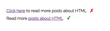
Link purpose can be determined from link text. As far as is possible, the purpose of a link should be able to be determined from the text that is within the anchor tag itself.
Provide more than one way to locate a web page. The same page should be accessible by more than just one link on one page. For example, a site could have -
- Complete site map on a single page
- Search function to access all content
- Navigation with links to all pages
Provide information about the current location. It is useful to provide information about where the current page is in relation to the rest of the website. This can be achieved with any of the following -
- Breadcrumbs
- Site map
- Highlighting the current location in navigation
- Using the
<link rel="index | next | prev | contents">tag to specify the current page's relationship to other pages
Principle 3 - 'Understandable" #
3.1 Readable #
"Make text content readable and understandable."
Specify the language(s) of the page. Specify the language of the current page on the HTML element, and any languages of specific parts.
<html lang="en"> <!-- Language of the page is English -->
<head>
</head>
<body>

<h1>Page Title</h1>

<p>Health goth American Apparel quinoa, jean shorts cray you probably haven't heard of them Schlitz
occupy actually tofu distillery disrupt letterpress fixie. Slow-carb keytar hella, actually B
ushwick irony semiotics Portland readymade photo booth taxidermy pork belly small batch try-hard yr.
Thundercats blog normcore, tousled American Apparel art party.</p>

<!-- Language of this blockquote is German -->
<blockquote lang="de">
  Da dachte der Herr daran, ihn aus dem Futter zu schaffen,
  aber der Esel merkte, daß kein guter Wind wehte, lief fort
  und machte sich auf den Weg nach Bremen: dort, meinte er,
  könnte er ja Stadtmusikant werden.
</blockquote>

<p>Health goth American Apparel quinoa, jean shorts cray you probably haven't heard of them Schlitz
occupy actually tofu distillery disrupt letterpress fixie. Slow-carb keytar hella, actually B
ushwick irony semiotics Portland readymade photo booth taxidermy pork belly small batch try-hard yr.
Thundercats blog normcore, tousled American Apparel art party.</p>

</body>
</html>
Provide meanings of unusual words and pronunciations of difficult words. You can use the title attribute to provide the meaning of abbreviations and unusual words. For definitions, you can use the dl element to provide a definition list.
<!-- Providing meaning inline -->
<abbr title="Austin Rocks">Au5t1N r0xx0rz</abbr>

<!-- Using a definition list -->
<p>That was a <a href="#d-humblebrag">humble brag</a></p>

<dl>
  <dt id="d-humblebrag">Humble Brag</dt>
  <dd>Subtly letting others now about how fantastic your life is while undercutting
  it with a bit of self-effacing humor or "woe is me" gloss.</dd>
</dl>
Make content available at a lower secondary education reading level. Teenagers aged between 11-14 should be able to understand the content, even if specific terminology and concepts are new.
3.2 Predictable #
"Make Web pages appear and operate in predictable ways."
Consistent navigation. Navigation elements should be repeated in a consistent way throughout the website.
Consistent identification. Terminology and repeatable elements should appear consistently throughout the website.
No unprovoked changes of context. Any changes of context should only happen on request by the user. Things like redirects, popups and other similar interactions should be communicated clearly beforehand.
<html>
  <head>
    <title>The Tudors</title>
    <meta http-equiv="refresh" content="0;URL='https://thetudors.example.com/'">
  </head>
  <body>
    <p>This page has moved to a <a href="https://thetudors.example.com/">theTudors.example.com</a>.
    You will now be redirected to the new site.</p>
  </body>
</html>
3.3 Input Assistance #
"Help users avoid and correct mistakes"
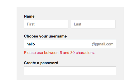
Provide labels and instructions - Provide labels or instructions for input elements. Where there is a commonly made error, provide suggestions that users can model their answers against.
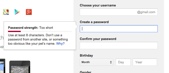
Error messages in simple language. Errors made should be described to the user in plain, understandable text, not error codes.
Error prevention. Where a user is submitting information, at least one of the following must be true -
- The submission of information is reversible
- The answers is checked for errors and the user is given the opportunity to correct before submission.
- The user is given the opportunity to confirm the information before submission
Principle 4 - "Robust" #
4.1 Compatible #
"Maximize compatibility with current and future user agents, including assistive technologies."
Write valid code. Ensure the compatibility of your HTML by making sure it passes validations checks. Some important things validation checks look for include -
- Valid doctype (Learn more about doctype)
- Valid character encoding specified (Learn more about character encoding)
- Complete start and end tags
- No duplicate attributes, for examples IDs
Specify the purpose of elements. Specify the name, role and value for user interface components where appropriate. For forms in particular, labels should be used where possible -
<form id="signupform">
  <label for="nm">Name</label>
  <input id="nm" type="text" name="name" value="">

  <fieldset>
    <legend>Would you like to sign up?</legend>
    <input id="yes" name="request" value="yes" type="radio"> <label for="yes">Yes</label>
    <input id="no" name="request" value="no" type="radio"> <label for="no">No</label>
  </fieldset>

  <button type="submit">Submit</button>
</form>
Where the label cannot be used, you can use the title attribute instead -
<form id="searchform">
  <input type="text" title="site search" name="query" id="q" value="">
  <input type="submit" value="search">
</form>
aria-label can also be used to provide a label for a user interface element, where a label may not be present.
<div id="box">
   This is a pop-up box.
   <button aria-label="Close"
           onclick="document.getElementById('box').style.display='none';"
           class="close-button"> X </button>
</div>
If you would like to read more about this, you can read the Web Content Accessibility Guidelines Reference, which goes into a lot more detail about how you can meet all the requirements.
I think the best thing that we can do is try to navigate the websites we create using only the mechanisms that people with disabilities use, such as screen readers. Doing this has really made me aware of things I should change on the sites I have made to make them easier to use.