Tips for making interactive elements accessible on mobile devices
The Web Content Accessibility Guidelines (WCAG) is a set a guidelines for how to make websites accessible. The second version was published in 2008, before websites were available on mobile devices in any meaningful way.
A few months ago, the WCAG was updated to version 2.1, which includes a whole new section on guidelines for mobile accessibility. There are several new mobile-specific rules, such as rule 1.3.4, that “content should not restrict its view and operation to a single display orientation, such as portrait or landscape, unless a specific display orientation is essential.”
In this article, I will cover some of the new guidelines that relate to interactive elements on a web page.
Place interactive elements where they can be easily accessed #
The first thing to consider with mobile devices is where any interactive/actionable elements are placed. Compared to the relatively rigid way we interact with desktop devices, mobile devices can be and are used in many different ways - one hand, two hands, left hand, right hand, etc.
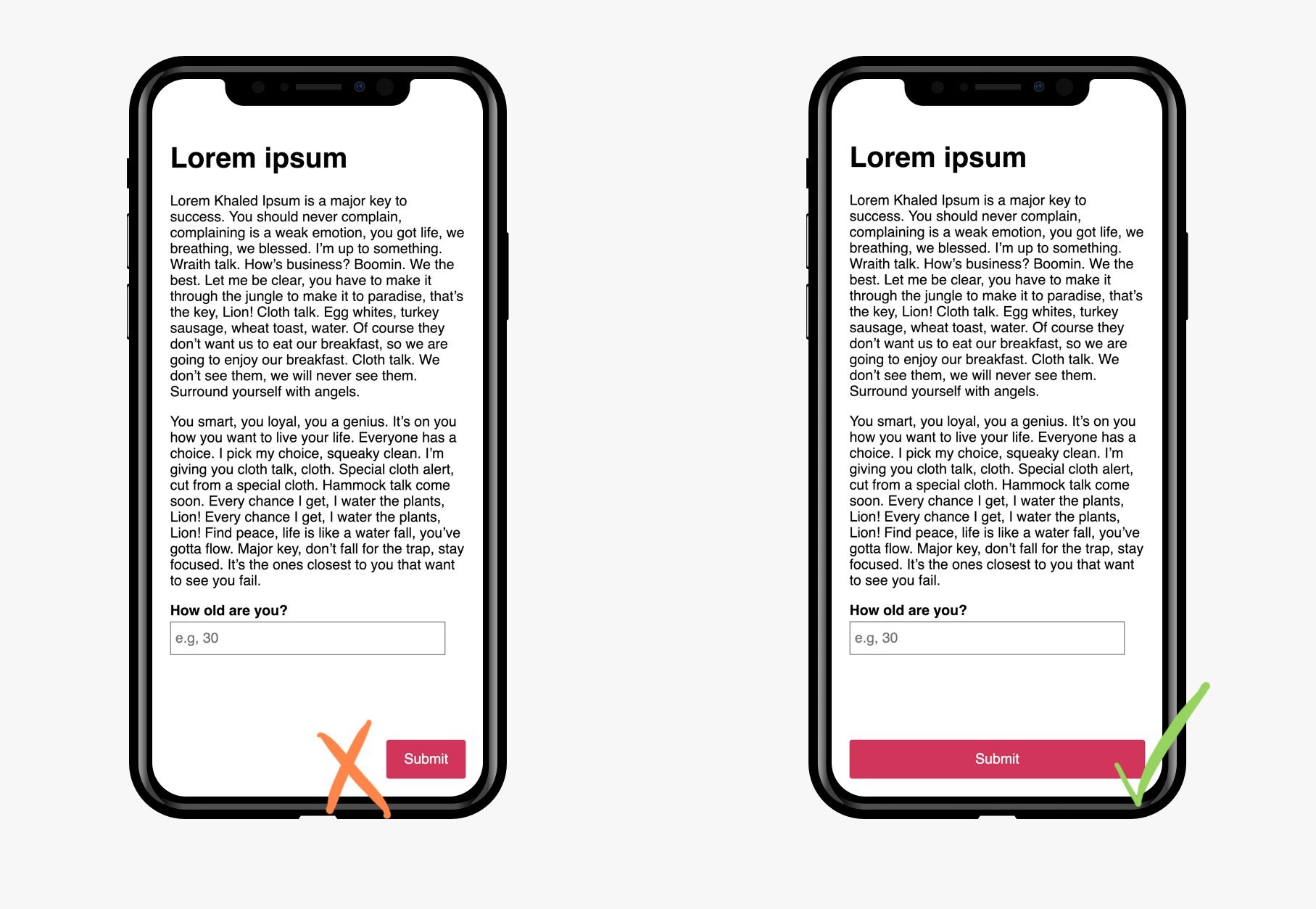
Due to this dynamic handling of mobile devices, this guideline suggests to create interfaces that are flexible. For example, it may be easy to think that placing a call-to-action in the bottom right corner is best because most users may use their device with their right hand. However, this would be the most inconvenient place to put it for left-handed users. A better placement for a critical call-to-action could be spanning the entire width of the viewport.

Make it clear that an element is actionable #
Compared to desktop, it can be a bit more challenging to let a user know that an element is actionable on touchscreen devices. Without hover states, we have to use the upfront look of the element alone to convey that a user can interact with it.
The best way to convey that an element is actionable is by relying on convention and what actionable elements are expected to look like. For example, links are typically underlined and/or have a distinct colour from the body text and are usually a rectangular shape with rounded corners.
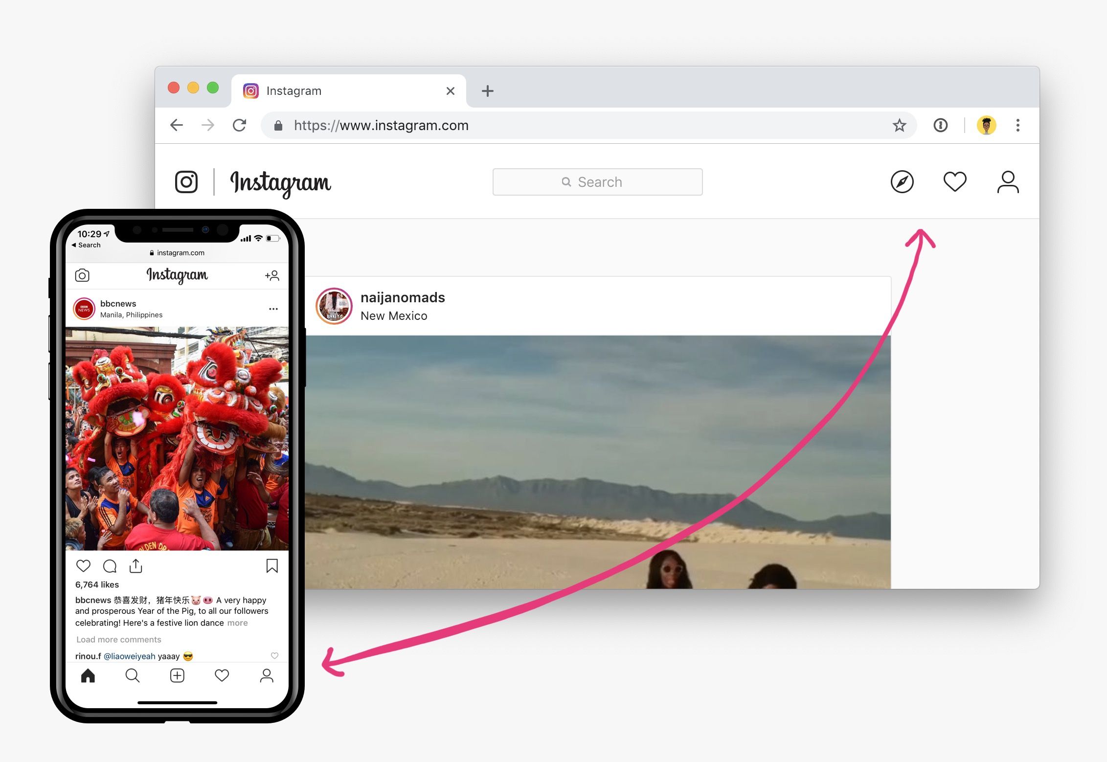
We can also use the position of an element to convey it’s use. The navigation, for example, is typically at the top of the page for conventional websites. For mobile devices, a navigation fixed to the bottom of the viewport is also common.

On Instagram desktop, the navigation is at the top of the page, whereas on mobile, it is in a bar at the bottom of the viewport
Provide instructions for custom gestures #
Following on from the previous guideline, it’s also more important on touchscreen devices to provide clear instructions on the gestures available.
A good example of this is the pull to refresh gesture. Unless there is some indication that this gesture is possible, users will never interact with it. On mobile twitter, they have an icon that pops up when the user scrolls to the top of the page, showing that there is an interaction available if they pull up more.
Provide a reasonable touch target size and spacing #
On touchscreen devices, the pointer is the user’s finger which, of course, is going to be a lot less precise that a mouse. Therefore, the area in which a user can tap to activate an interactive element needs to be big enough to accommodate different finger sizes.
According to guideline 2.5.5, actionable elements should generally have a size of at least 44px by 44px, unless the target element is inline within a block of text.
Group elements that perform the same action #
This guideline is best illustrated with an example. Let’s say we have a navigation link going to the website homepage, and beside it we also have a home icon. For layout purposes, we may want to separate the two elements and have two links going to the same place.
<a href="/"><img src="/home/png" alt="Home icon"></a>
<a href="/">Home</a>
Not advisable
This method has two main drawbacks:
- It reduces the touch target space, since the space between the two links will not be clickable
- It increases the number of elements that would need to be traversed through for a keyboard user. If navigating the page by tabbing on the keyboard, this duplication could become tedious if repeated numerous times
A better alternative would be to group both elements under the same interactive link.
<a href="/">
    <img src="/home/png" alt="Home icon">
    Home
</a>
Better!
This not only increases the touch target size for the link, it reduces the number of links that will need to be navigated through on the page.
Make typing easier with custom keyboard layouts #
One big hassle with touchscreen devices is typing on onscreen keyboards. We can make this a little easier by providing a custom keyboard layout that is specific to the type of input required.
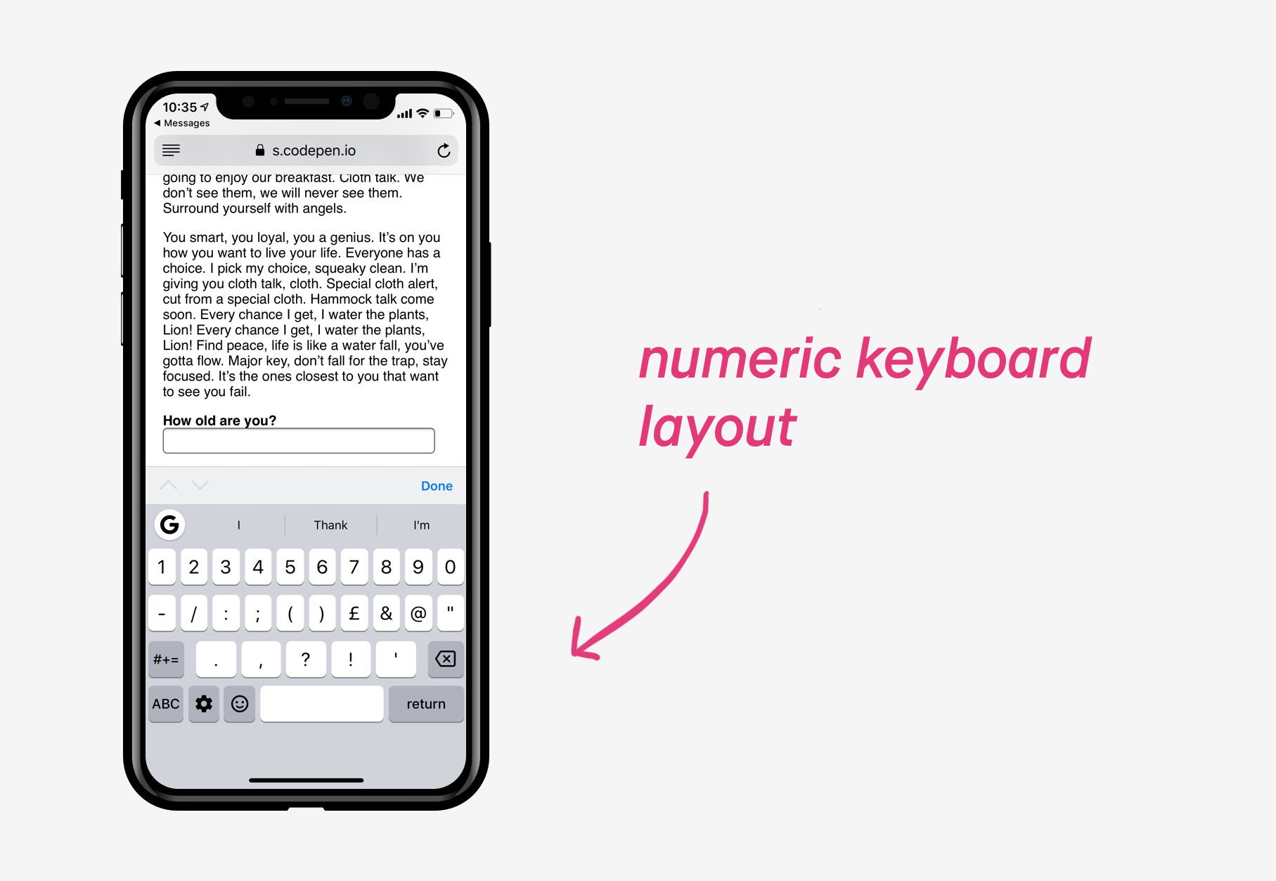
For example, if a numeric input is required, we can use a number-only keyboard layout by specifying the type on the <input> element.
<label>
    How old are you?
    <input type="number">
</label>
In some cases, we need the type of the <input> element to be one thing, e.g. text, but we still want to restrict the keyboard layout to a numeric one. This can be achieved using the inputmode attribute, which allows us to specify what particular keyboard layout we want for the input, regardless of the input type.
<label>
    How old are you?
    <input type="text" inputmode="numeric">
</label>
At the time of writing, the inputmode attribute is not very well supported.
Provide alternatives to typing #
Another way to handle the hassle of typing on a touchscreen device is to reduce the amount of typing the user needs to do in the first place.
Generally speaking, on mobile devices, inputs such as checkboxes, radios, and selects are easier to work with on mobile than plain text boxes.
In places that need text entry, we can try to automatically fill out information. For example, by pulling location data to fill out addresses.
