Understanding border-image
The border-image property is a relatively new property, which allows us to specify images to be used as borders instead of the typical border styles (border-style, border-color).
The border-image property does not affect the box model border area, which is controlled by the border-width property. However, the border-image property is still dependent on the existence of a border area. If border-width is set to 0, the border-image property will not apply.
The border image belongs to its own border image area, which is not the same as the border area, as we will see.
The border image area, unlike the border area, extends aross the whole element, including the other box model areas (border area, padding area, content area).
This allows us to use the border image (despite its name) as a background for the element, but also allows the border image to extend outside the border area.
The border-image property is a shorthand for 5 properties controlling the border image -
border-image-sourceborder-image-sliceborder-image-outsetborder-image-repeatborder-image-width
The shorthand is writing in this order -
border-image: <source> <slice> <width> <outset> <repeat>
border-image-source #
| Values | Description |
|---|---|
url(path/to/image.jpg) |
The path to the image |
none |
No image |
The border-image-sourceproperty defines the path to the image to be used as the border. The image is used instead of any border-style value. The nature in which the image is applied depends on the other four border image properties.
border-image-slice #
| Values | Description |
|---|---|
| number | A number representing pixels (although the unit should not be written) |
| percentage | Percentage of the height/width of the full size image |
fill |
Image is not sliced |
The border-image-slice property defines how the image is sliced to create the border. The values specify how far, going from the outer edges of the image inward, before we slice the image. It does not control the width of the resulting border image, which is controlled by border-image-width, but rather it controls how the image is cropped to fit the border image area.
.foo { border-image-slice: 50; }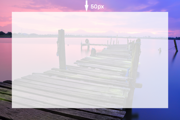
We can alo specify different values for the four sides of the image -
.foo { border-image-slice: 50 100 200 100; }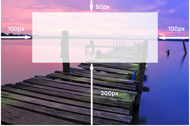
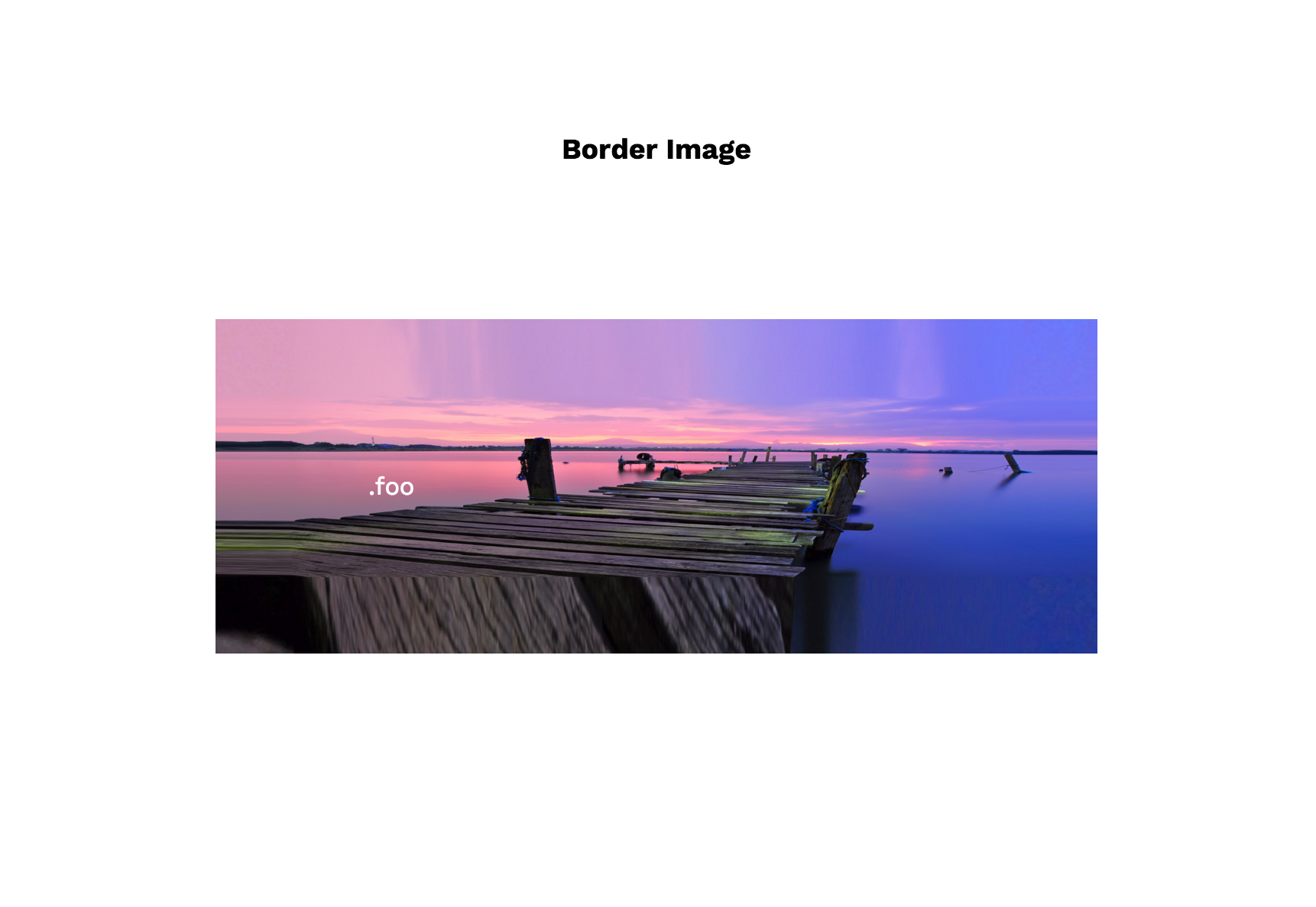
By default, if a number or percentage value is given alone, the middle section of the image is removed to create a normal “border” effect. However, if we add the fill keyword, the image is not cut and fills up the background of the element. For example -
.foo {
  border-image-slice: 50 fill;
}
border-image-outset #
| Values | Description |
|---|---|
| number | A number representing multiples of the corresponsing border-width |
| length | A pixel value (including px unit) |
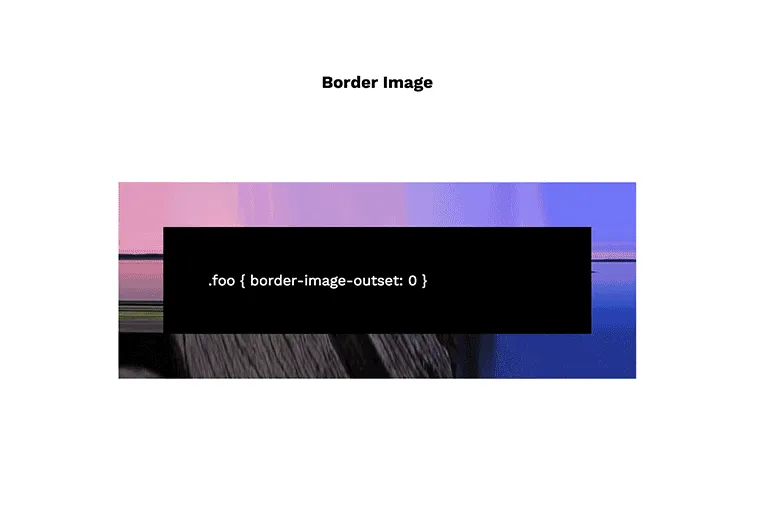
The border-image-outset property defines how much the border image area extends outside the border area.
A value of 0 means that the border image area does not extend outside the border area at all. A value of 2 means the border image area extends outside the border area by 2 times the border-width. Similar to border-image-slice, we can specify values for each side of the border image.
.foo {
  border-width: 50px;
  border-image-outset: 0; /* border image area will map on border area exactly */
  border-image-outset: 2; /* extends outside by  100px (50px x 2) */
  border-image-outset: 0 1 2 3;
}
border-image-repeat #
| Values | Description |
|---|---|
stretch |
The image is stretched to fill the border image width |
repeat |
The image is tiled/repeated to fill the border image width |
round |
The image is tiled. If it does not fill the area with a whole number of tiles, the image is rescaled |
space |
The image is tiled. If it does not fill the area with a whole number of tiles, extra space is redistributed between the tiles |
The border-image-repeat property defines how the image should be scaled or tiled if it is not big enough to cover the full border area. Here is how the different values handle the same image -
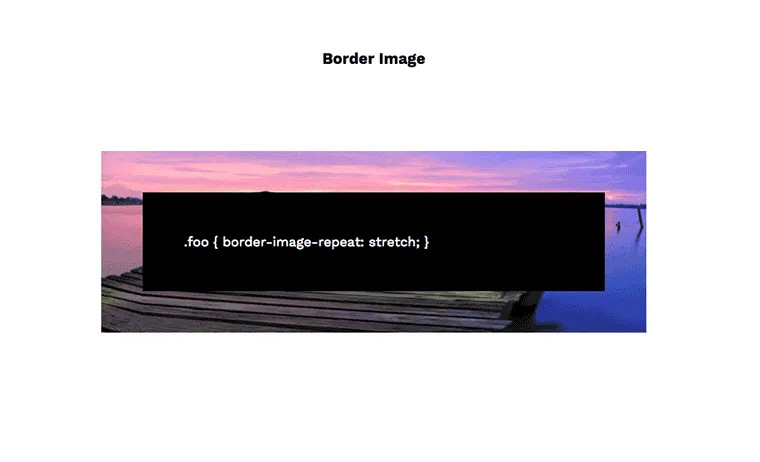
We can specify a different behaviour for the vertical sides and for the horizontal sides of the border image area.
.foo {
  border-image-repeat: stretch repeat; /* horizontal vertical*/
}
border-image-width #
| Values | Description |
|---|---|
| number | A number representing multiples of the corresponsing border-width |
| percentage | Percentage of the border image area |
| length | A pixel value (including px unit) |
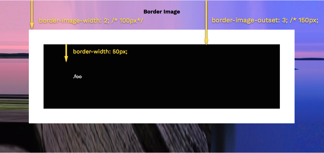
The border-image-width property defines the actual width of the border image. Although, by default, the width is the same as the border-width, the width of the border image can actually be more or less. We can specify one value for all four sides, or specify each side’s value.
If we use a number value, this represents multiples of the corresponding border-width. For example -
.foo {
  border-width: 50px;
  border-image-outset: 3;
  border-image-width: 2; /* = 100px */
}
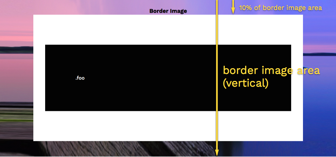
If we specify a percentage value, this is calculated based on the border image area. This is made up of the whole element area plus any outset specified by the border-image-outset.
.foo {
  border-width: 50px;
  border-image-outset: 3;
  border-image-width: 10%;
}