Understanding the difference between grid-template and grid-auto
With all the new properties related to CSS Grid Layout, one of the distinctions that always confused me was the difference between the grid-template-* and grid-auto-* properties. Specifically the difference between grid-template-rows/columns and grid-auto-rows/columns. Although I knew they were to do with the explicit and implicit grid systems, at face value they seemed to be doing almost the same thing. In actual fact, they have little in common and are used to achieve different things.
What are explicit and implicit grids? #
To understand the difference between the grid-template-* and grid-auto-* properties we first need to understand the difference between the explicit and implicit grids.
The definitions of explicit and implicit grids can be a bit circular. The explicit grid, for example, is defined by the property used to create the explicit grid - the grid-template-* properties. According to the W3C Candidate Recommendation:
The three properties
grid-template-rows,grid-template-columns, andgrid-template-areastogether define the explicit grid.
The implicit grid, on the other hand, is essentially defined as "everything else" -
When grid items are positioned outside of [the explicit grid], the grid container generates implicit grid tracks by adding implicit grid lines to the grid. These lines together with the explicit grid form the implicit grid.
Although these definitions may be a bit difficult to conceptualise at first, it can be helpful to rephrase it.
Within a grid container, there are grid cells. Any cell positioned and sized using the grid-template-* properties forms part of the explicit grid. Any grid cell that is not positioned/sized using this property forms part of the implicit grid instead.
How do the grid-template and grid-auto properties differ? #
Because the structure and syntax of the grid-template-* and grid-auto-* property names have some similarities, it can be easy to think the values they accept and therefore what they achieve, are similar as well. On the contrary, these properties are doing very different things.
While the grid-template-* properties are used to define both the position and size of grid cells, the grid-auto-* properties are used only to define the size of grid cells.
This difference becomes apparent when you consider what these properties are for. The grid-template-* properties are used to create an explicit grid, whereas th grid-auto-* properties are used to size an implicit grid (which is automatically created).
How grid-template works #
There are four grid-template-* properties - grid-template-rows, grid-template-columns, grid-template-areas, and grid-template - the last being a shorthand for the first three. For the purpose of this article, I'm going to focus on the first two.
Let's take grid-template-rows. If we want to create a grid with one row of 100px height, we would use the following CSS -
.grid {
	display: grid;
	grid-template-rows: 100px;
}
If we want to add another row, we simply add another length value, space-separated to the first.
.grid {
	display: grid;
	grid-template-rows: 100px 100px;
}
We can do the same for columns using the grid-template-columns property.
Although there are several ways to define the height/width of each row/column using the grid-template-* properties, there is always a one-to-one match between a value and a track. As I showed in the example above, each space-separated length value represents a single row. This is how the grid-template-* properties are used to, not only define sizing, but position and layout of the grid cells.
How grid-auto works #
There are three grid-auto-* properties - grid-auto-rows, grid-auto-columns, and grid-auto-flow. For the purpose of this article, I'm going to focus on the first two.
The grid-auto-rows and grid-auto-columns properties accept a single length value, which is used to define the size of any implicit grid cells. For example, we can define that any implicit grid rows should have a height of 100px -
.grid {
	display: grid;
	grid-auto-rows: 100px;
}
Unlike the grid-template-* properties, the grid-auto-* properties only accept a single length value.
Working with explicit and implicit grids #
To better understand the difference between the grid-template-* and grid-auto-* properties, and therefore explicit & implicit grids, let's take the following HTML -
<div class="grid">
  <div class="cell">Cell 1</div>
  <div class="cell">Cell 2</div>
  <div class="cell">Cell 3</div>
  <div class="cell">Cell 4</div>
  <div class="cell">Cell 5</div>
  <div class="cell">Cell 6</div>
  <div class="cell">Cell 7</div>
  <div class="cell">Cell 8</div>
</div>
And the following CSS -
.grid {
	display: grid;
	grid-gap: 10px; /* add spacing for better visibility */
}
Currently, our grid looks like this -
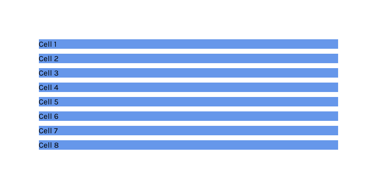
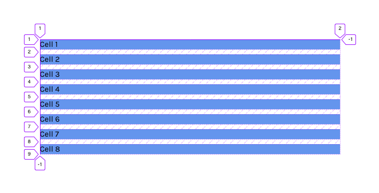
Although it may seem like nothing has happened, an implicit grid has actually been created. This grid has a single column and as many rows as there are grid cells. We can see this if we use the grid inspector in Firefox.
Sizing the implicit grid with grid-auto #
If we wanted to specify the size of the height of these rows, we can use the grid-auto-rows property.
.grid {
	display: grid;
	grid-gap: 10px; /* add spacing for better visibility */
	grid-auto-rows: 30px;
}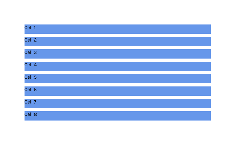
Note that all we have done is given a single height value, and this style is applied to all rows within the grid.
Creating an explicit grid with grid-template #
Now let's define an explicit grid. We can create an explicit grid that has two rows, each with a height of 100px -
.grid {
  display: grid;
  grid-gap: 10px; /* add spacing for better visibility */
  grid-auto-rows: 30px;
  grid-template-rows: 100px 100px;
}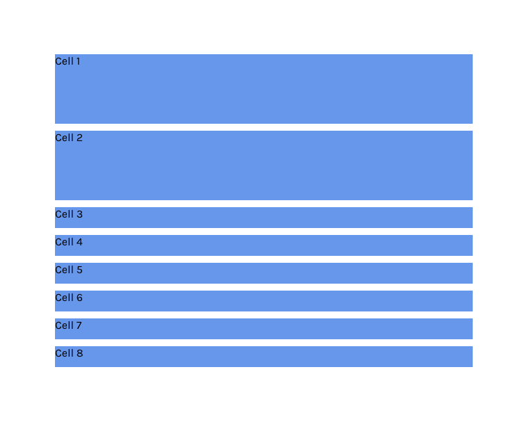
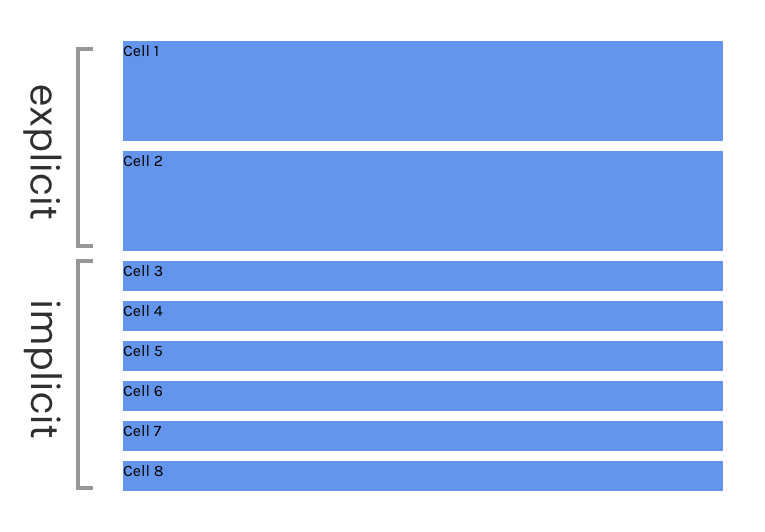
What we can see is that only the first two rows have the height of 100px, and the rest have the height defined by the grid-auto-rows property. We can more clearly see the distinction between the explicit and implicit grids in the image below -
Summary #
To summarize, the grid-template-* properties are used to create, place, and size cells for the explicit grid. Any cell that exists in the grid that is not explicitly created by this property forms part of the implicit grid, which can be sized by the grid-auto-* properties.