A More Accessible Multi-Level Dropdown Navigation
One of the biggest accessibility issues I see, and face myself, are with navigation menus, particularly multi-level drop-down menus. So this week, I decided to work on creating the most accessible multi-level dropdown menu I could.

Aims #
There were four things I was trying to achieve -
1. The navigation should be user input agnostic #
There are many different ways users can interact with websites, especially now with the introduction of touchscreen devices. So, I wanted the navigation to be able to respond to these four methods of user input -
- Using a mouse to hover over the element
- Clicking on the element with a mouse
- Tapping on the element on a touchscreen
- Tabbing into and out of the element with a keyboard
A lot of solutions I have seen work well with some of these methods of user input, but not necessarily the others. For example, the css-only dropdown menu doesn't work for users navigating with a keyboard. This is because it uses the :focus or :hover pseudo-class on the li rather than an actionable element.
2. These methods of user input should be screen size agnostic. #
It is no longer reliable to assume that a smaller viewport means that the user is on a tablet and tapping on the screen, or that larger viewports mean that the user is on a desktop and is accessing the site with a mouse or keyboard.
Therefore, I wanted this menu to be able to respond to click events on smaller viewports, as well as tap events on larger viewports.
3. Responsive design #
Because everything has to be responsive.
4. Provide some fallback for users without javascript. #
Supporting users without javascript can be a bit of a contentious issue. According to the UK Government Digital Service, 1.1% of users (in the UK) do not have javascript enabled. Regardless of the debate, as my aim with this was to create something as accessible as possible, providing some fallback was necessary.
My Solution #
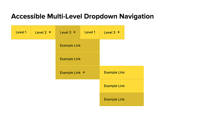
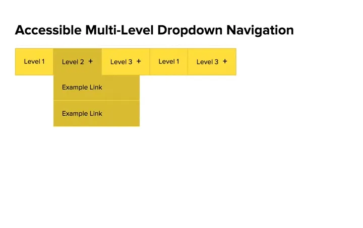
This is what it looks like going through all the levels of the navigation using only the keyboard -

The Markup #
The HTML follows the standard structure for drop-down navigations -
<nav id="nav">
  <ul>

    <!-- Menu tooggle on smaller screens -->
    <li id="toggleMenu">
      <a href="/sitemap.html">
        <i class="fa fa-bars"></i> <i class="fa fa-times"></i>

        <!-- As icons are being used to represent open/close,
             provide hidden text for screen readers -->
        <span id="toggleMenu-text">Toggle Navigation</span>

      </a>
    </li>

    <!-- Simple menu item without sub menu -->
    <li><a href="/">Level 1</a></li>

    <!--  Menu item with one sub menu -->
    <li>
      <a href="/sitemap.html">Level 2</a>

      <!-- sub menu (level 2) -->
      <ul>
        <li><a href="/">Example Link</a></li>
        <li><a href="/">Example Link</a></li>
      </ul>
    </li>

    <!--  Menu item with two levels of sub menu -->
    <li>
      <a href="/sitemap.html">Level 3</a>

      <!-- sub menu (level 2) -->
      <ul>
        <li><a href="/">Example Link</a></li>
        <li><a href="/">Example Link</a></li>

        <li>
          <a href="/">Example Link</a>

          <!-- sub menu (level 3) -->
          <ul>
            <li><a href="/">Example Link</a></li>
            <li><a href="/">Example Link</a></li>
            <li><a href="/">Example Link</a></li>
          </ul>
        </li>
      </ul>

    </li>

  </ul>
</nav>
The JavaScript #
The script was organised into three sections. First, the section controlling what happens when users interact with a list item that has a sub menu -
// When interacting with a li that has a sub menu
$('li:has("ul")').on('mouseover keyup click mouseleave', function(e) {

  // If either -
    // tabbing into the li that has a sub menu
    // hovering over the li that has a sub menu
  if ( e.keyCode === 9 | e.type === 'mouseover' ) {
    // Show sub menu
    $(this).children('ul').removeClass('js-hideElement');
    $(this).children('ul').addClass('js-showElement');
  }


  // If mouse leaves li that has sub menu
  if ( e.type === 'mouseleave' ) {
    // hide sub menu
    $(this).children('ul').removeClass('js-showElement');
    $(this).children('ul').addClass('js-hideElement');
  }


  // If clicking on li that has a sub menu
  if ( e.type === 'click' ) {

    // If sub menu is already open
    if ( $(this).children('a').hasClass('js-openSubMenu') ) {

      // remove Open class
      $(this).children('a').removeClass('js-openSubMenu');

      // Hide sub menu
      $(this).children('ul').removeClass('js-showElement');
      $(this).children('ul').addClass('js-hideElement');

    // If sub menu is closed
    } else {

      // add Open class
      $(this).children('a').addClass('js-openSubMenu');

      // Show sub menu
      $(this).children('ul').removeClass('js-hideElement');
      $(this).children('ul').addClass('js-showElement');
    }

    return false;
  } // end click event

});
Second, the section controlling the opening and closing of sub menus when users navigate using a keyboard -
 // If key is pressed while on the last link in a sub menu
$('li > ul > li:last-child > a').on('keydown', function(e) {

  // If tabbing out of the last link in a sub menu AND NOT tabbing into another sub menu
  if ( (e.keyCode == 9) && $(this).parent('li').children('ul').length == 0 ) {

    // Close this sub menu
    $(this).parent('li').parent('ul').removeClass('js-showElement');
    $(this).parent('li').parent('ul').addClass('js-hideElement');

    // If also tabbing out of a third level sub menu
    // AND there are no other links in the parent (level 2) sub menu
    if ( $(this).parent('li').parent('ul').parent('li').parent('ul').parent('li').children('ul').length > 0
       && $(this).parent('li').parent('ul').parent('li').is(':last-child') ) {

        // Close the parent sub menu (level 2) as well
        $(this).parent('li').parent('ul').parent('li').parent('ul').removeClass('js-showElement');
        $(this).parent('li').parent('ul').parent('li').parent('ul').addClass('js-hideElement');
    }

  }
})
Finally, the section controlling the menu toggle for smaller screens, adding the plus mark for list items that have a sub menu, and removing the no-js class on the html element -
// toggle menu on smaller screens
$('#toggleMenu').on('click', function() {
  if ( $(this).hasClass('js-open') ) {
      $('#nav > ul > li:not(#toggleMenu)').removeClass('js-showElement');
      $(this).removeClass('js-open');
  } else {
      $('#nav > ul > li:not(#toggleMenu)').addClass('js-showElement');
      $(this).addClass('js-open');
  }
  return false;
})

// Add plus mark to li that have a sub menu
$('li:has("ul") > a').append('<span class="plusMark">+</span>')

// Remove no-js class
$('html').removeClass('no-js');
No-JS Fallback #
For users without JavaScript enabled, I provided two fallbacks -
1. For users able to use a mouse or tap on screen, I used the css only dropdown-navigation. This solution uses the adjacent sibling selector (+) plus the :hover and :focus pseudo-classes to hide and reveal the sub menus.
html.no-js li:hover > a + ul {
  display: block;
}

@media screen and (max-width: 650px) {
  html.no-js #nav:hover > ul > li:not(#toggleMenu) {
    display: block;
  }
  html.no-js #nav:hover li:hover > a + ul {
    display: block;
  }
}
2. For users using a keyboard, provide a link to another page with a full site map. Although this may be an edge case, it is simple to provide this as an absolute fallback.
<!--  Menu item with one sub menu -->
<li>
  <a href="/sitemap.html#level2">Level 2</a>

  <!-- sub menu (level 2) -->
  <ul>
    <li><a href="/">Example Link</a></li>
    <li><a href="/">Example Link</a></li>
  </ul>
</li>
That's it! This actually took a lot longer than I thought it would, trying to deal with the many different type of user interaction, and I'm sure there are improvements I can make. If you have any comments or feedback, leave a comment below.
