Challenge - Recreating the iTunes Library
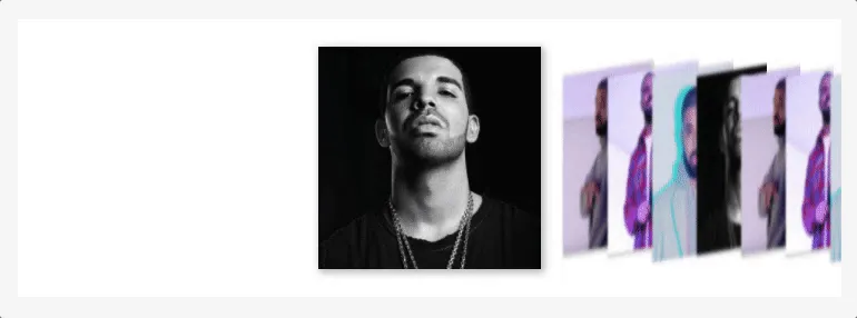
It's time for another UI challenge! In the first challenge, we recreated some interactions from the MacOS application, Clear. In this one, we are recreating the look of the old iTunes library gallery.
The Challenge #
Start the Challenge | Live Demo with My Solution
The key interactions we are trying to recreate -
- The gallery of “albums”/“cards” should stacked horizontally.
- When inactive, each card should be arranged “stacked” as shown above
- When active, the card should be displayed in full view.
- When the user hovers over a card, it should be slightly enlarged. When they click on the card, it should become active.
- The user should be able to move through the cards by pressing the TAB or Arrow keys.
Extra credit 🤓 -
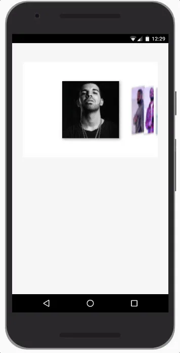
- Mobile functionality. Users should be able to swipe right and left to move between cards
- The active card should always be entered horizontally within the container
- The library should be navigable without JavaScript enabled
My Solution #
Styling the Cards #
The first step was to style the cards so they looked like stacked items you could swipe through. This effect was achieved mainly though using a couple of transforms. First, I used the skewY() 2D transform, which skews the element along the Y-axis, giving it a distorted look. For example, this is an animation moving the value of the skew from 0 to 20deg -

I also used the rotateY() 3D transform, which rotates the element around it’s Y-axis, making it seem like it is folded towards the user. For example, this is an animation moving the value of the rotation from 0 to 50deg -

I also added a few other styles, notably -
- Negative margins to have the appearance of the cards being stacked on top of each other
- Scale transform to shrink the card when not active
- Blur filter to create a blurred out effect
.card {

  z-index: 1;
  flex-shrink: 1;

  outline: none;
  height: 150px;
  width: 150px;
  margin-left: -40px;
  margin-right: -40px;

  transform: rotateY(60deg) skewY(-5deg) scale(0.8);
  box-shadow: 1px 1px 5px 1px rgba(0,0,0,0.3);
  filter: blur(2px);

  transition: transform 1s,
              margin-left 1s,
              margin-right 1s,
              box-shadow 1s,
              filter 1s,
              flex-shrink 1s;
}
Handling Focus, Active & Hover States #
In the markup, each "card" is simply a div, but it could be any element, interactive or non-interactive. However, I wanted to make sure the element would be focusable so the "active" card could be accessed using the keyboard tab or arrow keys. To ensure this, I used the tabindex attribute set to 0, to add each card to the natural tabbing order of the page.
<div class="card" tabindex="0">
	<!-- card content here -->
</div>
When the card is in focus or active, I apply the styles to make it pop out.
.card:active,
.card:focus,
.card.js-active {
    transform: none;
    margin-left: 40px;
    margin-right: 40px;
    box-shadow: 2px 2px 10px 1px rgba(0,0,0,0.3);
    filter: none;
    flex-shrink: 0;
    z-index: 2;
}
When a user hovers over a card with their pointing device, I wanted to make it obvious that the card can be clicked to fully expand.
.card:hover:not(:active):not(:focus):not(.js-active) {
    margin-left: -20px;
    margin-right: -20px;
    box-shadow: 2px 2px 10px 1px rgba(0,0,0,0.3);
    filter: none;
    cursor: pointer;
}
To avoid conflict with the other styles, I made sure to only apply these mouse hover styles if the card is not currently active or in focus.
Handling Swipes and Keyboard Events #
On mobile, I needed to make sure that users could use swiping gestures to move between individual cards. To do this, I used custom event listeners written by cocco on Stack Overflow -
// Source - https://stackoverflow.com/a/17567696
window.onload = function() {
(function(d){
 var
 ce=function(e,n){var a=document.createEvent("CustomEvent");a.initCustomEvent(n,true,true,e.target);e.target.dispatchEvent(a);a=null;return false},
 nm=true,sp={x:0,y:0},ep={x:0,y:0},
 touch={
  touchstart:function(e){sp={x:e.touches[0].pageX,y:e.touches[0].pageY}},
  touchmove:function(e){nm=false;ep={x:e.touches[0].pageX,y:e.touches[0].pageY}},
  touchend:function(e){if(nm){ce(e,'fc')}else{var x=ep.x-sp.x,xr=Math.abs(x),y=ep.y-sp.y,yr=Math.abs(y);if(Math.max(xr,yr)>20){ce(e,(xr>yr?(x<0?'swipeLeft':'swipeRight'):(y<0?'swipeUp':'swipeDown')))}};nm=true},
  touchcancel:function(e){nm=false}
 };
 for(var a in touch){d.addEventListener(a,touch[a],false);}
})(document);
};
With these event listeners, I could detect if a user was swiping right (swipeRight) or left (swipeLeft). Depending on which direction, I could then set the active card to be the previous or next card in the group.
function swipeCard(direction) {

	let focusedElement = document.querySelector('.card.js-active') ? activeCard : document.activeElement;
	if ( !focusedElement ) return;
	if ( !focusedElement.classList.contains('card') ) return;

	let focusedElementIndex = 0;
	for (let i = 0; i < cards.length; i++) {
		if (cards[i] === focusedElement) focusedElementIndex = i
	}

	switch(direction) {
		case 'right':
			setActiveCard( cards[focusedElementIndex - 1] );
			break;
		case 'left':
			setActiveCard( cards[focusedElementIndex + 1] );
			break;
		default:
			break;
	}

}

document.body.addEventListener('swipeRight', function() {
	swipeCard('right');
});

document.body.addEventListener('swipeLeft', function() {
	swipeCard('left');
});
Centering the Active Element #
Finally, I wanted to ensure that the active card will always be horizontally in the middle of the container element.
In Flexbox, there is a property to ensure that a flex item will always be vertically in the middle of the container element, which is align-self. In the future, there will be a similar property for horizontal alignment, justify-self ( See the prospective specification ). However, this is not yet available, so to do this, I had to use JavaScript.
In the markup, there are two container elements - .card-outer-container and .card-inner-container.
<div class="card-container-outer">
	<div class="card-container-inner">

		<div tabindex="0" class="card"> ... </div>
		<div tabindex="0" class="card"> ... </div>
		<div tabindex="0" class="card"> ... </div>
		<div tabindex="0" class="card"> ... </div>

	</div>
</div>
The outer container is what defines the height and width of the group. The inner contain has a larger width, and is what I shift left and right to make sure the active card is aligned to the centre of the outer container.
To get to the amount of pixels from the left I need to shift the inner container, I subtract the following values -
- Half the width of the outer container
- Half width width of the card element
- The offset of the currently active card from the left
function alignActiveCard(card) {

	const halfOuterContainerWidth = outerContainer.clientWidth / 2;
	const halfCardContainerWidth = card.clientWidth / 2;
	const cardOffset = card.offsetLeft;

	const left = halfOuterContainerWidth - cardOffset - halfCardContainerWidth;
	innerContainer.style.transform = `translateX(${ left }px)`;
}
That's it! You can view a full demo of this on GitHub, and use it in a project yourself if you like.
Other Solutions #
If you do this challenge, leave a comment below and I'll add a list of your solutions here.