Responsive Design With Viewport Control
When it comes to implementing responsive design, css media queries seem to get all the attention. Although admittedly all the leg work is done with media queries, a site is not responsive without viewport control.
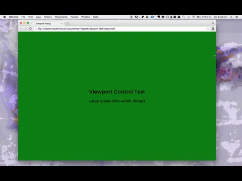
When we want to alter the layout of a site depending on screen size, we typically write something like this:
@media screen and (min-width: 960px) {
body { background-color: green; }
}
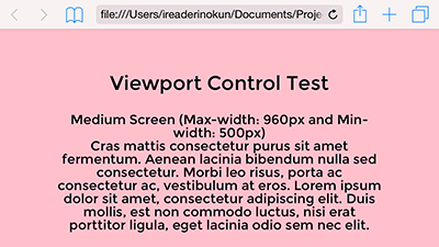
@media screen and (max-width: 960px) and (min-width: 500px) {
body { background-color: pink; }
}
@media screen and (max-width: 500px) {
body { background-color: yellow; }
}
When testing the responsiveness of the site by resizing the browser, everything seems to work fine.
The problem #
The problem arises when viewing the responsive site on a mobile device.
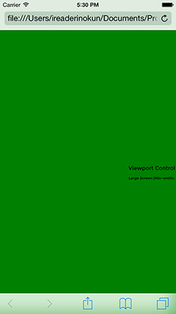
As you can see, even though the page is being viewed from an iPhone 6, the page is rendering as though in the desktop view. This is caused by a discrepancy between the size of the device and the size of the viewport. To understand this, three distinctions need to be made.
-
Device pixel - The amount of pixels on the physical display. An iPhone 6, for example, is 375x667 pixels. (Side note: there are two types of device pixels - hardware pixels and device independent pixels - but this distinction is not pertinent).
-
CSS pixel - This is an abstract unit we use in CSS declarations. Taken alone, 1 CSS pixel does not have an objective size. Instead, how 1 CSS pixel renders on the webpage is determined by the viewport.
-
Viewport - This determines the pixel density of the page. A viewport width of, for example, 750px, would mean that 750 CSS pixels would span the width of the screen (with a 1:1 scale).
The viewport is "device agnostic", it doesn't inherently know how big our device screen actually is.
By default, most browsers set the viewport size between 800px and 1024px. This explains why in our example, the desktop view is showing despite the actual device width.
Viewport control with the meta tag #
One of the metadata we can pass with the meta tag is viewport. This allows us to control certain aspects of the viewport and solve the discrepancy. The tag follows the following structure -
<meta name="viewport" content="key=value, key=value">
There are 6 "keys" we can pass for the content -
- width
- height
- initial-scale
- minimum-scale
- maximum-scale
- user-scalable
Width #
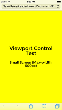
This allows us to set the width of the viewport ourselves, instead of relying on the inaccurate default. We can set the width to a specific number in pixels, but it is advisable to set the width equal to the device width. This allows us to accommodate varying screen sizes.
<meta name="viewport" content="width=device-width">
By adding this, we now get the accurate view.
Initial-scale #
On mobile devices, users have the ability to zoom in and out on the page. When a user zooms in, this changes the viewport pixel sizing, but not the CSS pixel sizing.
For example, we have an element of
width: 100px;within a viewport of 400px width. At this point, the element spans 1/4 of the screen. If the user zooms in to a scale of 2, the viewport width now becomes 200px, but the element remains 100 CSS pixels wide. At this point, the element spans 1/2 of the screen.
Setting the initial-scale tells the browser what the ratio between CSS pixels and viewport pixels should be on the initial load of the page. Generally, this will be 1:1.
This parameter is paticularly needed to address a problem caused by setting width=device-width>. Some mobile browsers by default will use the width of the device in portrait mode, and so an inaccurate view will be given when the devide is rotated to landscape orientation.
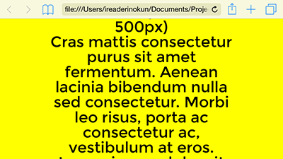
As you can see, when the iPhone is in landscape, we are still seeing the view for widths of less than 500px. This can be resolved by setting the initial-scale to 1.
<meta name="viewport" content="width=device-width, initial-scale=1">
User-scalable, maximum-scale, and minimum-scale #
These parameters control the user's ability to pinch-to-zoom on the page.
-
Maximum-scale - The maximum scale that a user can zoom in on the page. If set to 1, for example, the user will not be able to zoom in at all. If set to 2, the user will only be able to zoom in to a ratio of 1 CSS pixel to 2 viewport pixels.
-
Minimum-scale - The minimum scale that a user can zoom in on the page. For example, if this is set to 2, the user will be zoomed in by a 1:2 ratio by default and will not be able to zoom out to 1:1.
-
User-scalable - If set to
user-scalable=no, the user will not be able to zoom in or out at all.
Because these parameters restrict the users ability to access content, it is generally advised that they not be used.
every time you prevent zooming on your website a kitten dies https://t.co/eokrHZ6ieL — Brent Jackson (@jxnblk) March 25, 2015
Viewport control with css #
Although it is very widely supported, the viewport meta tag is not a formal part of HTML5. Instead, the W3C is working on implementing it into CSS with the@viewport rule. The @viewport rule works in a similar way to the meta tag and allows for the same declarations.
@viewport {
  zoom: 1.0; /* same as initial-scale=1 */
  width: device-width;
}

/* Vendor specific prefixes */
@-ms-viewport
@-webkit-viewport
@-moz-viewport
@-o-viewport
Until the @viewport rule is formalised, you should stick with the meta tag or use both.
TL;DR #
To ensure your media queries work on hand-held devices, put this in your <head>!
<meta name="viewport" content="width=device-width, initial-scale=1">
You can test the examples out for yourself on my github repo.