The box-shadow Property
The box-shadow property is a CSS3 property that allows us to create shadow effects on almost any element, similar to the drop shadows we can create in design software. These shadow effects allow us to create the illusion of depth in an otherwise flat, 2-dimensional-looking page.
The Syntax #
The box-shadow property accepts a value made up of up to 5 different parts.
box-shadow: offset-x offset-y blur spread color position;
Unlike other properties, such as border, in which the parts are broken up into sub-properties, the box-shadow property stands alone. This means that it is even more important to take note of the order in which the parts are stated, particularly the length values.
offset-x #
The first length value specified is the horizontal offset of the shadow, i.e. the position of the shadow on the x-axis. Positive values push the position of the shadow to the right of the element, whereas negative values push the position of the shadow to the left of the element.
.left { box-shadow: 20px 0px 10px 0px rgba(0,0,0,0.5) }

.right { box-shadow: -20px 0px 10px 0px rgba(0,0,0,0.5) }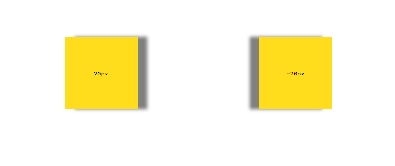
offset-y #
The second length value specified is the vertical offset of the shadow, i.e. the position of the shadow on the y-axis. Positive values push the position of the shadow below the element and negative values push the position of the shadow above the element.
.left { box-shadow: 0px 20px 10px 0px rgba(0,0,0,0.5) }

.right { box-shadow: 0px -20px 10px 0px rgba(0,0,0,0.5) }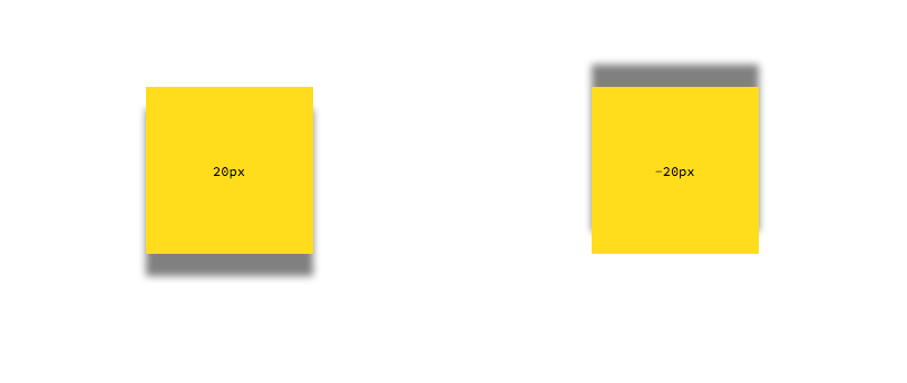
blur #
The third length value given represents the blur radius of the shadow, for example what you would get using a Gaussian blur filter in design software. A value of 0 means that the shadow is completely solid and sharp with no blur at all. The larger the blur value, the less sharp and more hazy/blurry the shadow. Negative values are not allowed and will result in a value of 0.
.left { box-shadow: 0px 0px 0px 0px rgba(0,0,0,0.5) }

.middle { box-shadow: 0px 0px 20px 0px rgba(0,0,0,0.5) }

.right { box-shadow: 0px 0px 50px 0px rgba(0,0,0,0.5) }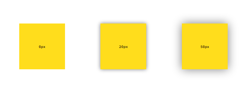
spread #
The fourth and final length value given represents the size of the shadow. This value can also be thought of us the distance of the shadow from the element. Positive values will extend the shadow outside the element in all directions by the amount specified. Negative values will shrink the shadow smaller than the element size. The default value of 0 will keep the shadow spread the same size as the element.
.left { box-shadow: 0px 0px 20px 0px rgba(0,0,0,0.5) }

.middle { box-shadow: 0px 0px 20px 20px rgba(0,0,0,0.5) }

.right { box-shadow: 0px 50px 20px -20px rgba(0,0,0,0.5) }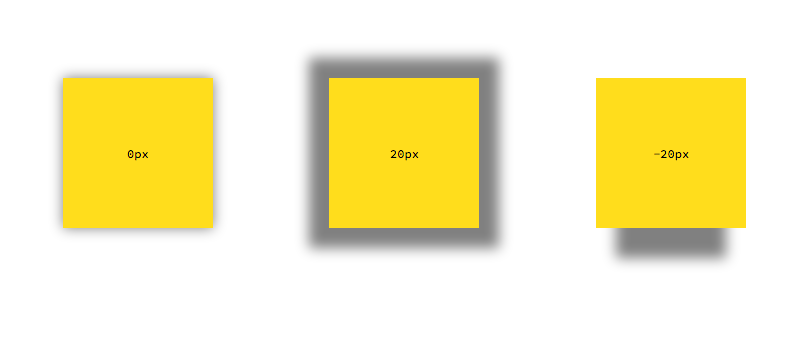
color #
A colour value given represents, as you would expect, the colour of the shadow. It can be any colour unit (see Working with Colour in CSS).
.left { box-shadow: 0px 0px 20px 10px #67b3dd }

.right { box-shadow: 0px 0px 20px 10px rgba(0,0,0,0.5) }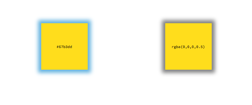
position #
The final part of the box-shadow property value is an optional keyword, which represents the position of the shadow. By default, this value is not given, which means that the shadow is an outer box-shadow. We can make the shadow an inner box shadow by using the inset keyword.
.left { box-shadow: 20px 20px 10px 0px rgba(0,0,0,0.5) inset }

.right { box-shadow: 20px 20px 10px 0px rgba(0,0,0,0.5) }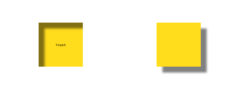
Multiple Shadows #
The box-shadow property is able to accept multiple shadows on a single element. Each shadow is added to the box-shadow property as a comma-separated list.
.foo {
	box-shadow: 20px 20px 10px 0px rgba(0,0,0,0.5) inset, /* inner shadow */
			    20px 20px 10px 0px rgba(0,0,0,0.5); /* outer shadow */
}
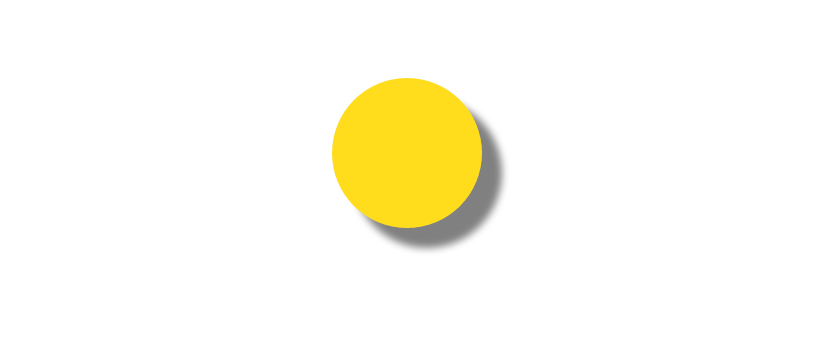
Rounded Shadows #
The box-shadow property's border-radius is controlled by the border-radius property on the same element.
.foo {
	box-shadow: 20px 20px 10px 0px rgba(0,0,0,0.5);
	border-radius: 50%;
}
Putting it all together #
Putting all of these parts together, we can create some amazing effects using the box-shadow property.
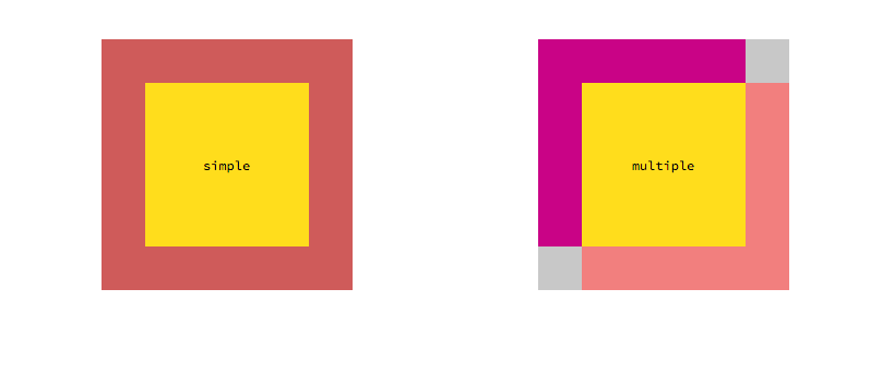
An Alternative Non-Layout-Blocking Border #
We can use the box-shadow property to create a border around an element that doesn't interfere with the box model or the rest of the layout of the page. Further, using the ability to have multiple shadows, we can have different borders on different sides of the element.
.simple {
	box-shadow: 0px 0px 0px 40px indianred;
}

.multiple {
	box-shadow: 20px 20px 0px 20px lightcoral,
				-20px -20px 0px 20px mediumvioletred,
				0px 0px 0px 40px rgb(200,200,200);
}
Pop-Up Effect #
Using transforms on the box-shadow (& transform) property, we can create the illusion of an element moving closer or further away from the user.
.popup {
	transform: scale(1);
	box-shadow: 0px 0px 10px 5px rgba(0, 0, 0, 0.3);
	transition: box-shadow 0.5s, transform 0.5s;
}
.popup:hover {
	transform: scale(1.3);
	box-shadow: 0px 0px 50px 10px rgba(0, 0, 0, 0.3);
	transition: box-shadow 0.5s, transform 0.5s;
}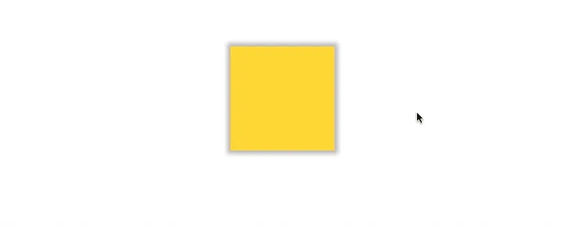
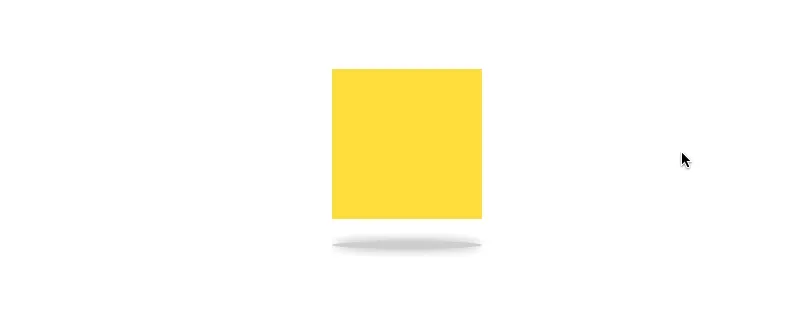
Floating Effect #
We can add a box-shadow to the :after pseudo-element as well. We can use this to create a shadow below the element, giving it the illusion of being lifted up or dropped down.
.floating {
	position: relative;

	transform: translateY(0);
	transition: transform 1s;
}
.floating:after {
    content: "";
    display: block;
    position: absolute;
    bottom: -30px;
    left: 50%;
    height: 8px;
    width: 100%;
    box-shadow: 0px 0px 15px 0px rgba(0, 0, 0, 0.4);
    border-radius: 50%;
    background-color: rgba(0, 0, 0, 0.2);

    transform: translate(-50%, 0);
    transition: transform 1s;
}

/* Hover States */
.floating:hover {
	transform: translateY(-40px);
	transition: transform 1s;
}
.floating:hover:after {
	transform: translate(-50%, 40px) scale(0.75);
	transition: transform 1s;
}
There are many other effects we can achieve with the box-shadow property. For example, this popular pen uses the property to create 8 paper-like effects. Even though it is ostensibly a tool for creating simple drop shadows, it can be a lot more powerful that that alone.