Responsive Images - The srcset and sizes Attributes
In the responsive web design revolution, images are one thing that have seemingly lagged behind. Until relatively recently, serving different images based on screen size or pixel density was not something that was done at all.
The <picture> element shows a lot of promise in changing this. But whether the picture element is used at all, there are two attributes that are key in providing responsive images - srcset and the accompanying sizes.
The srcset attribute #
The srcset attribute allows us to provide a set of images that can be potentially served by the browser. We, as the authors, provide a comma-separated list of images and the user agent determines which image to display depending on the particulars of the device.
When listing the images, we provide two pieces of information about each image -
- The path to the image file
- The pixel density or width of the image
To define pixel density, we add an x to the density number for the image. For example -
<img src="one.png"
     srcset="two.png 2x, three.png 3x, four.png 4x">
The image defined with the src attribute is assumed to be 1x.
When the srcset attribute was first specified in 2012, we could only provide images of different pixel densities, as shown above. However, the 2014 Specification introduced the width value, which allows us to assign the width of the different images.
To assign the width of the image, we add a w to the pixel width number for the image. For example -
<img src="one.png"
     srcset="two.png 100w, three.png 500w, four.png 1000w">
Only when using the width version of the srcset attribute, can we accompany it with the sizes attribute.
The sizes attribute #
The sizes attribute allows us to explicitly define the size the image should be according to a set of media conditions.
<img src="one.png"
     srcset="two.png 100w, three.png 500w, four.png 1000w"

     sizes="<media condition> <width>,
            <media condition> <width>,
            <optional default image width>">
Media Conditions #
A media condition is not exactly a media query. It is part of a media query. It doesn’t allow us to specify media types, e.g. screen or print, but accepts the condition we usually add to a media type.
A valid media condition can be either -
- A plain media condition, e.g.
(min-width: 900px) - A “not” media condition, e.g.
( not (orientation: landscape) ) - An “and” media condition, e.g.
(orientation: landscape) and (min-width: 900px) - An “or” media condition, e.g.
( (orientation: portrait) or (max-width: 500px) )
Width #
The width specified can be almost any length value, e.g. em, rem, pixels, and viewport width.
However, percentage values are not allowed, "to avoid confusion about what it would be relative to". The vw value is recommended as an alternative if a relative value is needed.
Putting it Together #
Putting the media condition and width together -
<img src="one.png"
     srcset="two.png 100w, three.png 500w, four.png 1000w"

     sizes="(min-width: 900px) 1000px,
            (max-width: 900px) and (min-width: 400px) 50em,
            ( not (orientation: portrait) ) 300px,
            ( (orientation: landscape) or (min-width: 1000px) ) 50vw,
            100vw">
If the media condition is true, the user agent will choose what image to serve at the size specified based on the different images defined in the srcset attribute.
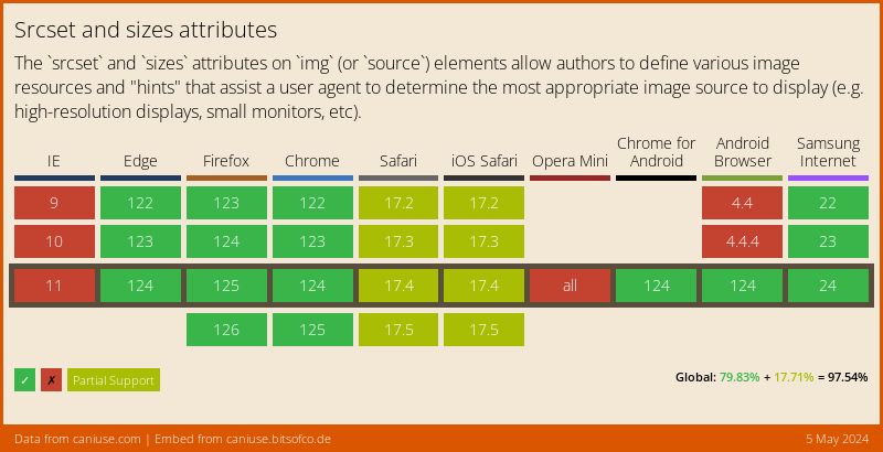
Support #
The srcset and sizes attributes are relatively well supported.
For browsers that do not support the attributes, the image is fetched from the regular src attribute and displayed normally across all media conditions.