Viewport vs Percentage Units
In my article about CSS font sizes, I wrote about the (relatively) new viewport units. These units - vw, vh, vmin, and vmax - are based on the size of the browser viewport. Because their actual size changes depending on the viewport size, this makes them great units for responsive design. Although in my previous post I argued against using these units for font sizes, they can be very useful for defining layout elements.
The viewport units #
The viewport units are relative units, which means that they do not have an objective measurement. Instead, their size is determined by the size of the viewport. There are four units related to the viewport -
| Name | Unit | Description |
|---|---|---|
| Viewport Width | vw | 1/100th of the width of the viewport |
| Viewport Height | vh | 1/100th of the height of the viewport |
| Minimum Viewport | vmin | 1/100th of the viewport’s smaller dimension (height or width) |
| Maximum Viewport | vmax | 1/100th of the viewport’s larger dimension (height or width) |
I will focus on the first two units, as they are more likely to be used.
In a lot of cases, the viewport units (vh and vw) and percentage unit overlap in terms of what they can achieve. However, they each have their clear strengths and weaknesses. To sum up -
When dealing with widths, the % unit is more suitable. With heights, the vh unit is better.
Full Width Elements - % > vw #
As I mentioned, the vw unit determines its size based on the width of the viewport. However, browsers calculate the viewport size as the browser window, which includes the space for the scrollbar.

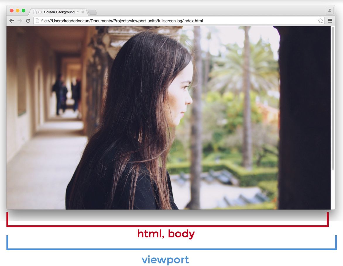
If the page extends more than the height of the viewport - which will make the scrollbar appear - the width of the viewport will actually be larger than the width of the html element.
Viewport > html > body
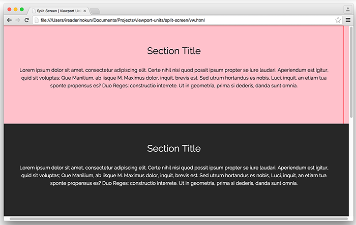
Therefore, if you set an element as 100vw, the element will extend outside the html and body elements. In this example, I put the red border around the html element, and the background colour on the sections.

Because of this nuance, when making an element span the entire width of the page, it is best to use the percentage unit, rather than the viewport width.
Full Height Elements - vh > % #
When making an element span the full height of a page, on the other hand, the vh unit is much better than the percentage unit.
Because the size of an element defined in percentage is determined by its parent element, we can only have an element fill the entire height of the screen if the parent element also fills the entire height of the screen. This usually means that we have to position the element as fixed, in order to make the html element the parent element, or otherwise resort to some hack.
With vh, however, it is as simple as writing:
.example {
  height: 100vh;
}
No matter how nested the .example element is, it is still able to be sized relative to the viewport dimensions. The problem of the scrollbar is also not an issue because most pages don't typically have the horizontal scroll bar present.
Here are some examples of how we can use the vh unit to easily create some designs.
The Fullscreen Background Image #
A typical use for the vh unit is for creating a background image that spans the entire height and width of the screen, no matter the size of the device. This is easily created with vh -
.bg {
  position: relative;
  background: url('bg.jpg') center/cover;
  width: 100%;
  height: 100vh;
}
Fullscreen Sections as "Pages" #
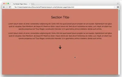
Similarly, we can also create the effect of having "pages" by making each section of the page span the full height and width of the viewport.
section {
  width: 100%;
  height: 100vh;
}
We can use javascript to create the illusion of flipping through the pages.
$('nav').on('click', function() {

  if ( $(this).hasClass('down') ) {
    var movePos = $(window).scrollTop() + $(window).height();
  }
  if ( $(this).hasClass('up') ) {
    var movePos = $(window).scrollTop() - $(window).height();
  }

  $('html, body').animate({
    scrollTop: movePos
  }, 1000);
})
Within the fold images #
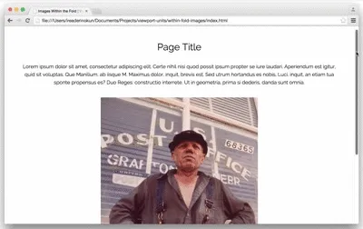
The vh unit can also be used to control the size of images within the page. For example, within an article, we may want to make sure that any image can be viewed in its entirety on the page, no matter the size of the screen.
To do that, we could set -
img {
  width: auto; /* Image width adjust to height to remain proportional */
  max-width: 100%; /* Image doesn't exceed parent element's width */
  max-height: 90vh; /* Image doesn't exceed viewport height */

  margin: 2rem auto;
}
Browser Support #
As these units are relatively new, there are still some issues with some browsers. Here is how to work around those problems -
| Browser | Issue | Solution |
|---|---|---|
| iOS Safari 7.1 | “vh” can be buggy | Target specific devices using media queries (see pburtchaell’s Gist) |
| Opera Mini 8, IE 8 | No support | Use pburtchaell’s solution |
| IE 9 | Accepts term “vm” instead of “vmin” | Declare the size using both units, e.g..example {``width: 100vm;``width: 100vmin;``} |
| IE 10-Edge | No support for “vmax” | Use pburtchaell’s solution |
