3 New CSS Features to Learn in 2017
Happy new year! 🎊
With the new year, we have a whole new set of things to learn. Although there are many new features, these are 3 new CSS features I'm most excited about adopting this year.
1. Feature Queries #
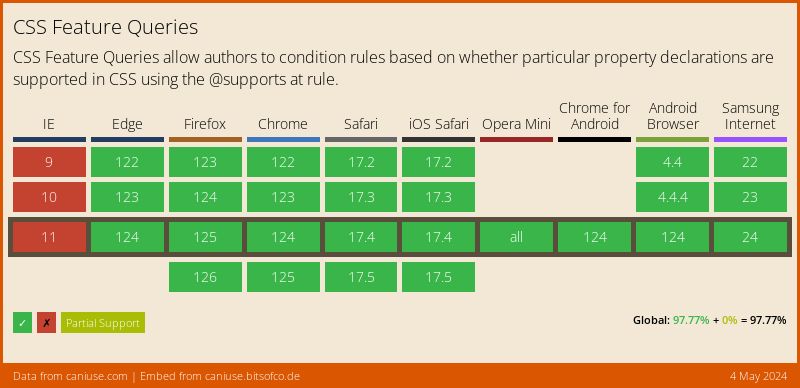
A while ago, I wrote about Feature Queries being the one CSS feature I really want. Well, now its basically here! It is now supported in every major browser (Opera Mini included) besides Internet Explorer.
Feature Queries, using the @supports rule, allow us to wrap CSS in a conditional block that will only be applied if the current user agent supports a particular CSS property-value pair. A simple example of this is to only apply Flexbox styles to browsers that support display: flex -
@supports ( display: flex ) {
  .foo { display: flex; }
}
Additionally, using operators like and and not, we can create even more complicated feature queries. For example, we can detect if a browser only supports the old Flexbox syntax -
@supports ( display: flexbox )
          and
          ( not ( display: flex ) ) {
  .foo { display: flexbox; }
}
Support #
2. Grid Layout #
The CSS Grid Layout Module defines a system for creating grid-based layouts. It has similarities with the Flexbible Box Layout Module, but is more specifically designed for page layouts, and thus has a number of different features.
Explicit Item Placement #
A grid is made up of the Grid Container (created with display: grid), and Grid Items (it's children). In our CSS, we can easily and explicitly orgnise the placement and order of the grid items, independent of their placement in the markup.
For example, in my article on The Holy Grail Layout with CSS Grid, I showed how we can use this module to create the infamous "holy grail layout".
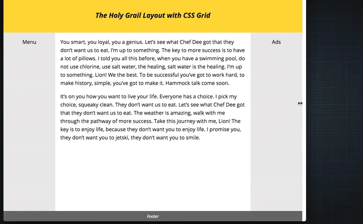
The underlying CSS was only 31 lines -
.hg__header { grid-area: header; }
.hg__footer { grid-area: footer; }
.hg__main { grid-area: main; }
.hg__left { grid-area: navigation; }
.hg__right { grid-area: ads; }

.hg {
	display: grid;
	grid-template-areas: "header header header"
	                     "navigation main ads"
	                     "footer footer footer";
	grid-template-columns: 150px 1fr 150px;
	grid-template-rows: 100px
						1fr
						30px;
	min-height: 100vh;
}

@media screen and (max-width: 600px) {
	.hg {
		grid-template-areas: "header"
		                     "navigation"
		                     "main"
		                     "ads"
		                     "footer";
		grid-template-columns: 100%;
		grid-template-rows: 100px
							50px
							1fr
							50px
							30px;
	}
}
Flexible Lengths #
The CSS Grid Module introduces a new length unit, the fr unit, which represents a fraction of the free space left in the grid container.
This allows us to apportion heights and widths of grid items depending on the available space in the grid container. For example, in the Holy Grail Layout, I wanted the main section to take up all the remaining space after the two sidebars. To do that, I simply wrote -
.hg {
	grid-template-columns: 150px 1fr 150px;
}
Gutters #
We can specifically define gutters for our grid layout using the grid-row-gap, grid-column-gap, and grid-gap properties. These properties accept a <length-percentage> data type as value, with the percentage corresponding to the dimension of the content area.
For example, to have a 5% gutter, we would write -
.hg {
	display: grid;
	grid-column-gap: 5%;
}
Support #
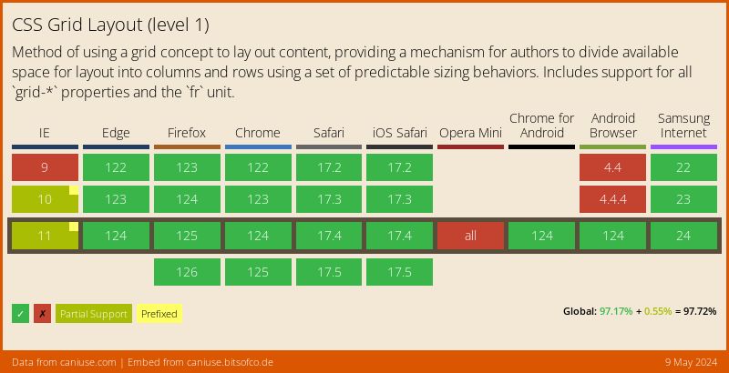
The CSS Grid Module will be available in browsers as early as March this year.
3. Native Variables #
Lastly, native CSS Variables (Custom Properties for Cascading Variables Module). This module introduces a method for creating author-defined variables, which can be assigned as values to CSS properties.
For example, if we have a theme colour we are using in several places in our stylesheet, we can abstract this out into a variable and reference that variable, instead of writing out the actual value multiple times.
:root {
  --theme-colour: cornflowerblue;
}

h1 { color: var(--theme-colour); }
a { color: var(--theme-colour); }
strong { color: var(--theme-colour); }
This is something we have been able to do with the help of CSS pre-processors like SASS, but CSS Variables have the advantage of living in the browser. This means that their values can be updated live. To change the --theme-colour property above, for example, all we have to do is the following -
const rootEl = document.documentElement;
rootEl.style.setProperty('--theme-colour', 'plum');
Support #
What about Support? #
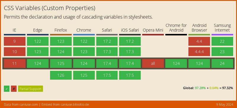
As you can see, none of these features are fully supported in every browser yet, so how do we comfortably usem the in production? Well, Progressive Enhancement! Last year I gave a talk about how to apply Progressive Enhancement in relation to CSS at Fronteers Conference. You can watch the talk below -
What CSS features are you excited about to learn in 2017?

